This item has been discussed before, but perhaps not exactly…
I have at a number of occasions experienced problems recognising letters in the Skritter (admittedly pretty) typeface as compared to more common typefaces found in print and elsewhere.
For instance Skritters “Xin1” (heart) is quite different from “Xin1” in print. Off course there are differences among char sets, but for beginners, it adds to the frustration level to grasp the chars wrongly.
So, please: Let the present Skritter font be the font for the seasoned user, and a simpler one, such as “MS Jhens Hei” or any of the “Hei” fonts be the default (or at least a choise)
I actually might disagree. Being exposed to different font styles can be important since everything isn’t always printed (or written) to look exactly the same way. If a character is fully learned, it should be legible even if written in chicken scratches assuming the correct stroke order is used. While that’s of course not the goal on Skritter to show a character that is hard to read, the writing canvas uses a more handwritten style that matches writing and a style also seen in textbooks. As you mentioned it’s also much prettier to stare at when printed large on the canvas.
I think the occasions you mention where you experienced problems recognizing letters probably caused those characters to become even more reinforced, so while it may have created a problem, it might have ended up becoming a solution
I think you have valid points, but maybe not for absolute beginners!
Experience with Skritter has led me to learn several characters wrong(ish) - and a newbie such as myself has no sense of criticism whatsoever: “If Skritter says a char looks like this, it train it like that”. Flexibility comes with experience.
Another example, besides xin1, is dian4, 饭. In my (faulty, beginners) perception, Skritter taught me that the uppermost line was just that, a horizontal “yi1”. In fact, this line is pie3.
Which, accidently, leads me to another point: If not another font/even in case of another font: It would be very helpful if Skritter named the individual stroke types when in demonstration mode.
And as to your last comment: You’re right off course - but I have thousands of chars in front of me. Learning chars wrong is not a very good way to memorise
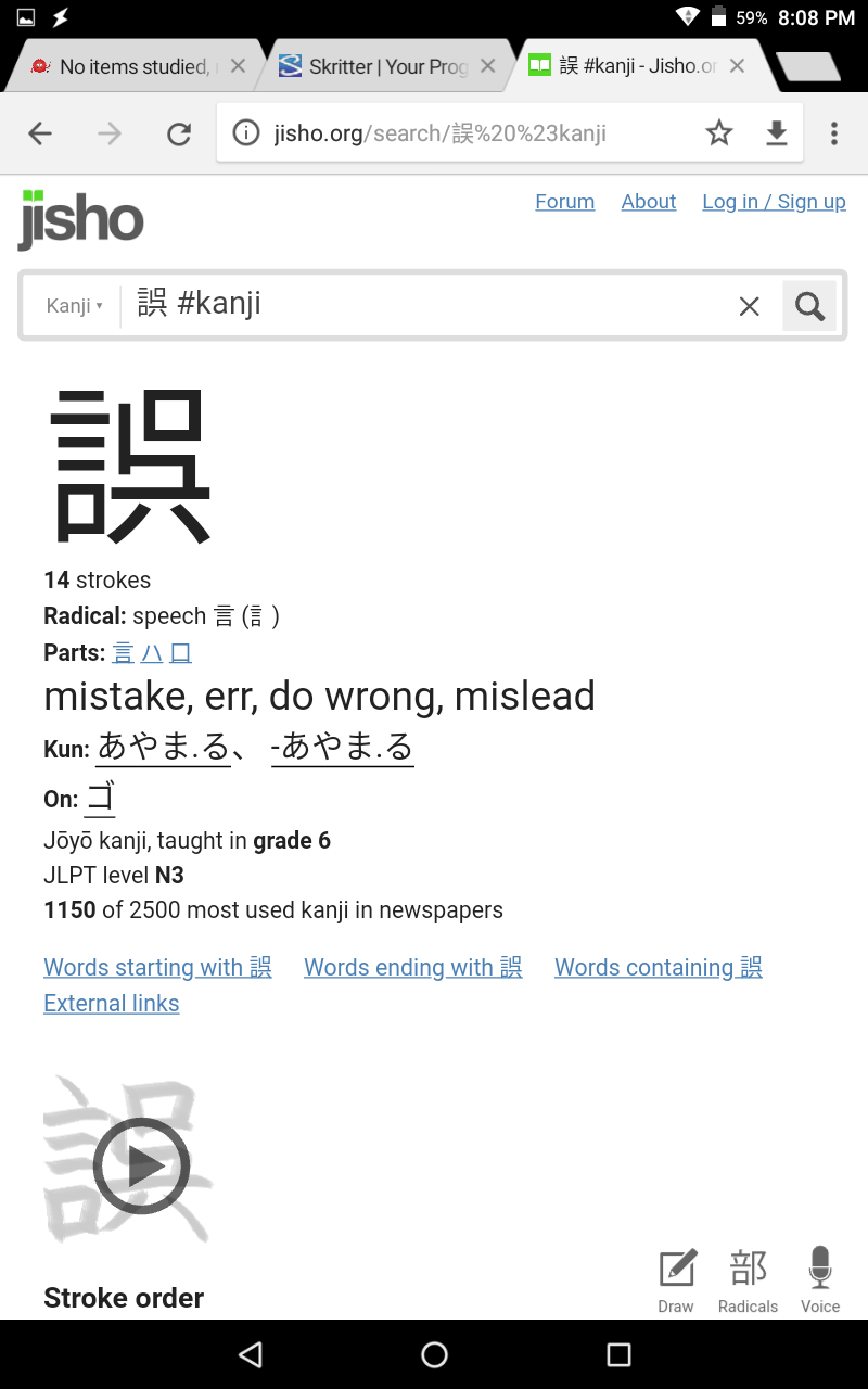
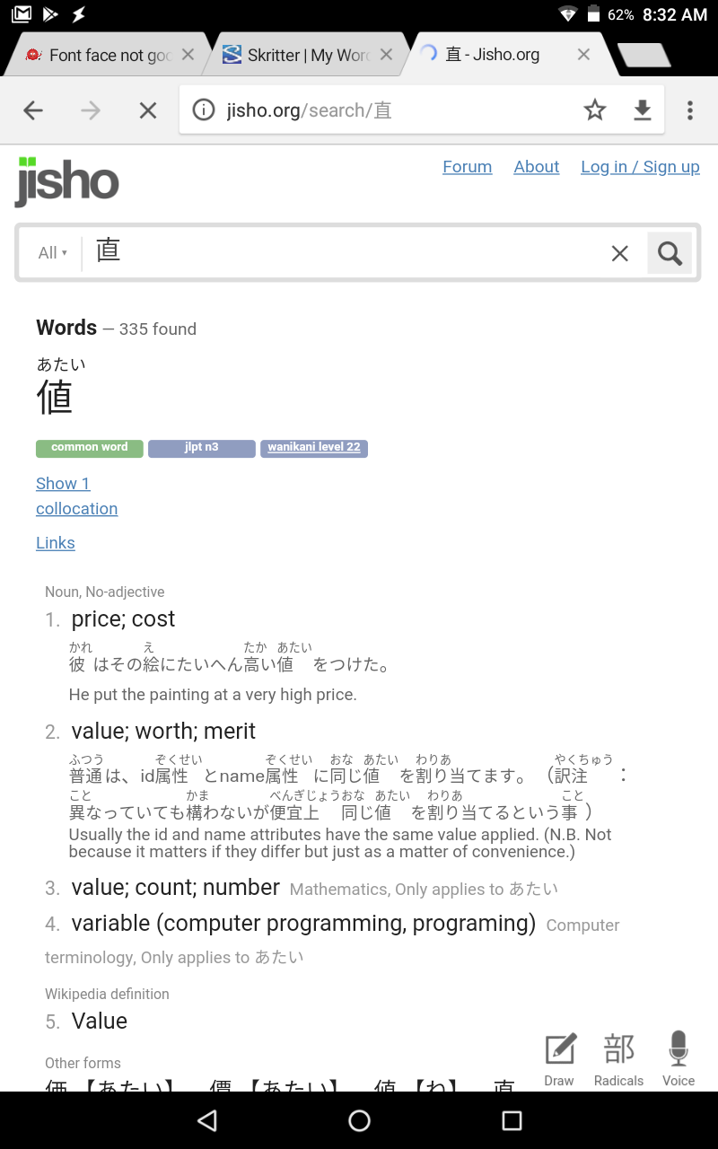
However, it does need to be remembered that some of the character variations are quite significant. In the screen shots below, the kanji in the url bar are the versions used in the main skritter font, while the ones in the body of the page are the more common ones and what skritter will expect to be written.
The second kanji in particular is a common one and it’s quite off-putting seeing it written quite differently to what I’m used to.
I don’t think there’s a simple right or wrong answer here and I still support using multiple fonts but the extent to which the skritter font (which is not what skritter expects people to write) is used in the real world (other than in the Chrome url bar) probably should be a consideration in the decision.
値 should be written 値, this looks like it’s a font issue in general. If you type あたい in your IME, the only options it should give are: 値, and 価. Did you manually write 直 in an IME pad? If you write 値 in the IME pad without the 人 radical, even though it looks correct in the IME (except minus the radical), the font will display 直 when you select it. For instance 値段 or 価値 use 値, however not 直