Sorry, I meant in this app. I see that the close button is in the right side of the legacy app.
Thanks, I had the same problem.
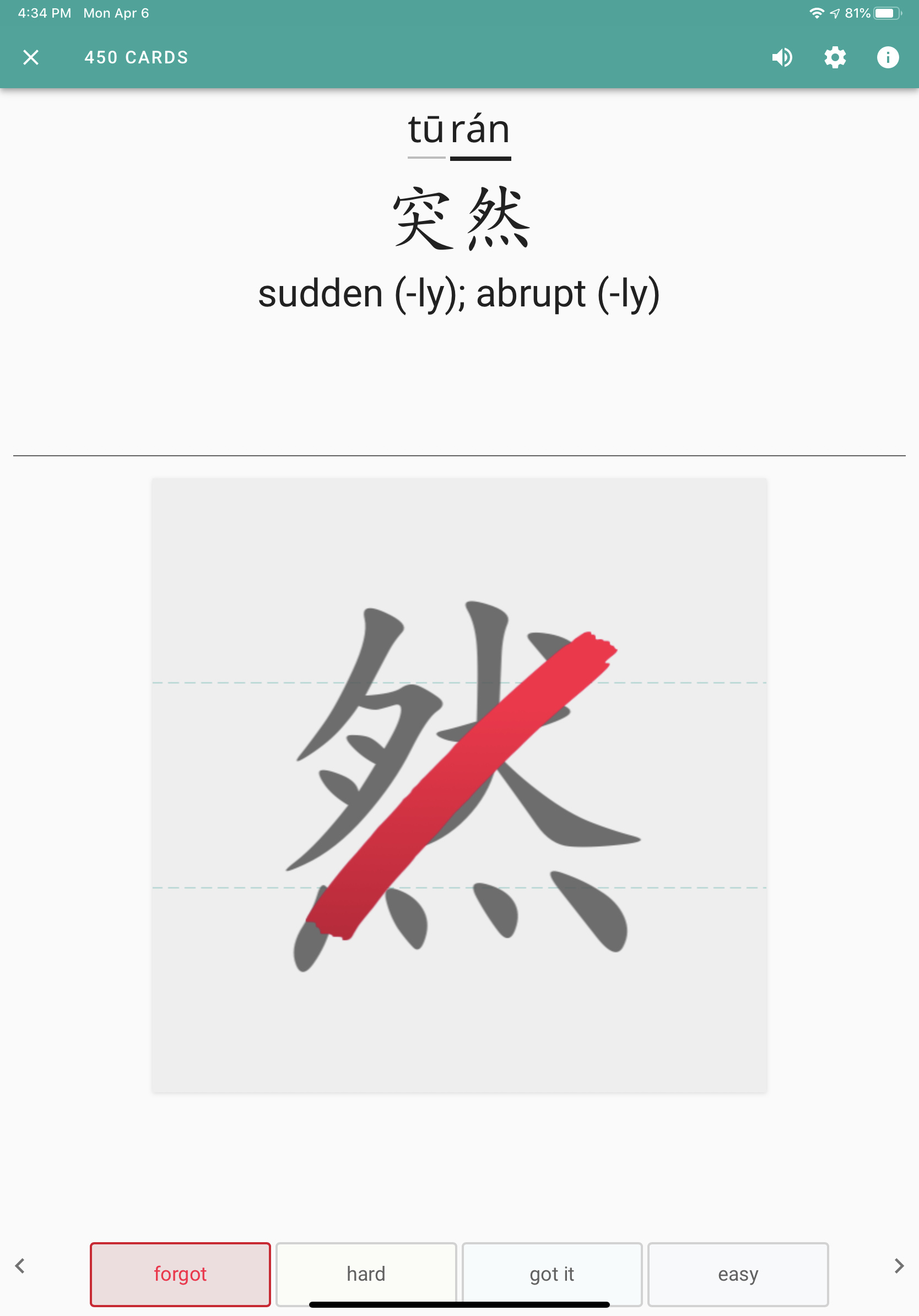
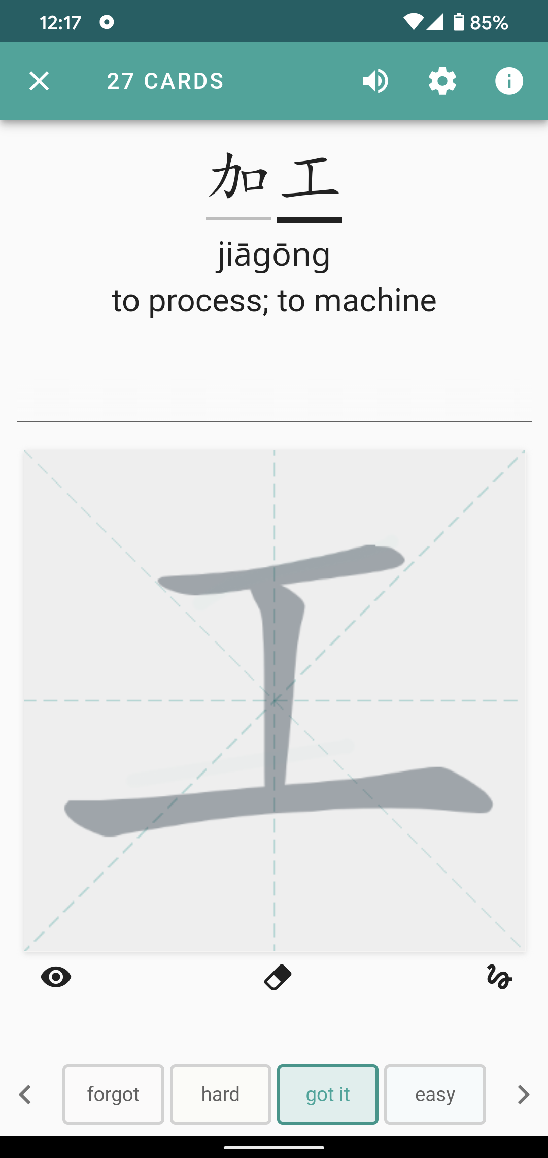
In my opinion, “rawest squigs” delivers on the promise of “raw squigs” (the latter feels too much like a game of battleship with a cheating opponent). The performance is bafflingly bad, though. It frequently drops strokes, and has long wait times when I hit “check answer”, which doesn’t makes sense for a writing mode which is theoretically doing less than any other mode. For example, after the first five, and then nine, strokes of 政:
Sometimes the strokes don’t appear at all. Sometimes they appear and immediately disappear.
I tried non-basic “raw squigs” and it turns out it has a similar behavior, but it appears the missing strokes are recognized… just not shown. Here’s a common example and a rather extreme one (no strokes, but correct!):
Assuming that issue is fixed, a great feature would be to actually attempt to grade the strokes at the very end. The common case should be the user is drawing the character correctly, and removing manual work in the common case would be a win.
Issue opened! We haven’t done a proper smoke test of the app and I totally missed this. I blame COVID-19 and the new “shelter in place” rules. There are lots of distractions these days!
Totally a bug for raw, and rawest. The ultra-lag when doing grading buttons is something totally new.
Speaking of bugs… can you all do us a favor and email us bugs from inside the app when you find them if possible? It is a super helpful to our workflow
We get a lot more details like device, OS, etc and can follow up individually a lot easier. We generally tag and track emails based on issue type, which is a lot easier to scan short-term and long-term.
None of us on the team have seen the “rawest squigs” registering super slowly, for example. So, this is obviously something that we want to fix and improve.
Bonus points for steps to reproduce. It cuts down on the amount of back and forth before we open the issue and work on the fix!
I love the discussion on the forum. Feedback on how things feel, and ways we can improve things is great, but reporting bugs via email is very much preferred. We need the details if you can provide them so we’re all on the same page, and a lot of that is automatically generated when the email gets sent.
It’ll help make the production release better. And it’ll happen a lot quicker that way (in theory).
Thanks in advance!
Also, totally unrelated to 3.4.0 feedback, but I really hope everyone is staying as safe and healthy as possible with everything going on!
-Jake
Thanks, Jake, I will try to do in-app bug reporting. Personally I am not having problems with lagging on the rawest squigs. I am at home with a strong WiFi and Internet connection.
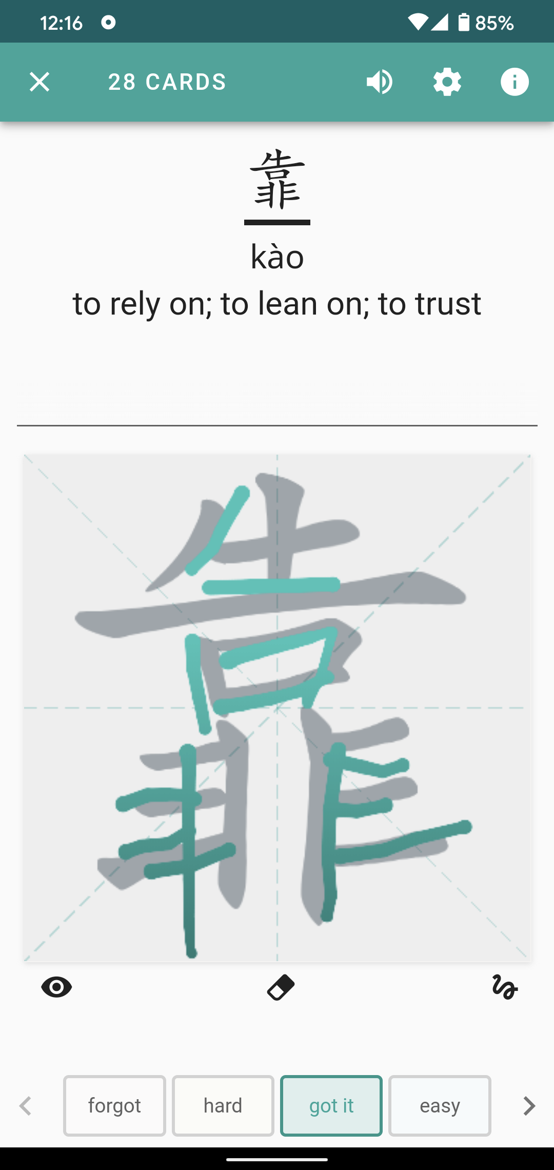
I am liking the new feature (still think you need to change the name before finishing beta) I like that I don’t get credit for words I hadn’t finished attempting to write. I am still getting used to the rawest squigs, but so far I think I would prefer to be able to ask Skritter to automatically grade the finished product after I mark it complete, with an option to override on a character by character basis, similar to how raw squigs works. That may just be me being used to old habits though.
1 Like
Another general thing I would like to see. Is it possible to offer the option to show the example sentence right under the respective question? I know that I can see the example sentence by clicking on the top box, however, I find it handy to have it right away in the screen. There is enough space for that and for me it would be a great help as I can also see direct examples of how to use words I learn. As I mentioned, this should only be optional as I assume not everybody will like that.
We just released another beta build on Android and iOS. Here are the build notes for reference:
3.4.0 (v. 300372)
- Added “Rawest Squigs” support to the basic writing canvas
- Improved stroke animations for raw/rawest squigs
- Overall visual progress for decks studied on the mobile client will now display on Skritter website Dash and Study Queue
- Resetting a deck on the mobile app will reset the website percent
Note: We are still working on updating the section-level progress and pointers on the website after studying from mobile
Basic writing canvas will now support “rawest squigs,” and we made some stroke animation adjustments to the non-basic canvas that hopefully fix the disappearing strokes cut-off stroke issues some of you have been reporting.
We’re planning on moving the contained characters onto the Info tab based on some of the feedback we’ve been getting, but we haven’t gotten it finished yet. So we’ll try to get that change into the next update.
-Jake
I just repeat my previous post as I have not received any feedback on this.
“Another general thing I would like to see. Is it possible to offer the option to show the example sentence right under the respective question? I know that I can see the example sentence by clicking on the top box, however, I find it handy to have it right away in the screen. There is enough space for that and for me it would be a great help as I can also see direct examples of how to use words I learn. As I mentioned, this should only be optional as I assume not everybody will like that.”
Great question. It might be possible, but there are a several things from preventing us from just displaying them by default at the moment.
- Not all screens are equal
You might have enough space on your screen, but that doesn’t apply to all users. We still have some people rocking iPhone 5s, for example and similarly sized devices on Android.
- Quality of example sentences
While we’ve written sentences for HSK 1-4 vocab, there are still lots of lousy example sentences in our system. We’re starting an audit process soon to begin cleaning up super high-frequency vocabulary, but we don’t want to show all the sentences we have in the app front and center at the moment.
- Lack of customizability
Similar to the second issue, we currently don’t support the ability to create custom example sentences, so if you’re not happy with the thing we’re displaying, you can’t change it.
- Sentence support for multiple readings, and/or multiple meanings
Another complicated issue if we want to show example sentences on the screen. In a perfect world, we have a good sentence for each definition and reading. Supporting this directly on a study card, however, means we’re heading into endless scroll mode.
Thanks for the detailed message. I totally understand your points. As I said, I would only want to see that as an extra option, so you can toggle it on if you wish to do so. If you see you don’t need it, then you just toggle it off again. Of course you should leave it off as default, so people don’t get confused first. I just think it can be really handy to have this, especially when you have thousands of cards. I find myself knowing lots of words after some time and I often ask myself how to use the word in a daily context. If I have the example sentence right on the screen, I simply will learn that sentence all together with the respective word which helps me to recall it in a real conversation. That’s even more the case if you repeat the cards so many times as in Skritter. As you said correctly, this is highly linked to a solid quality of example sentences, but at least that’s the case for HSK 1-4. And for the future, this will remain a key challenge for your team to improve this. Nevertheless, I don’t see any disadvantage of providing the OPTION, please correct me if I’m wrong.
We’re certainly considering better example sentence support in some way in the future!
Just pushed out another beta build. Here’s what we’ve updated and fixed for 3.4.0 (v. 300380):
- Added word-level grading support to 2+ character writing and tone cards (if you get a character wrong in a 3+ character word it’ll automatically be marked “incorrect” by default, rather than “hard”)
- Improved example sentence and mnemonic support on study cards (swipe-left for sentence, swipe-right for mnemonic)
- Removed the “characters” tab on the word (2+ characters) info screen
- Deleting a deck on the website will now sync with the app without clearing local data
- Section-level pointers now match on the website after learning on mobile
- Added Sync button to the deck options screen (great for forcing updated to the mobile app if you happen to study on the website and then open the mobile app)
- Fixed an issue preventing some corrections emails from being sent successfully
As I mentioned my concerns regarding the example sentences earlier, I personally think it’s a step back to access the example sentences via the “i” button on the top right corner. At least I prefered it to open it by clicking the upper box, that was a bit more handy to access rather than the top right button. However, that is not possible with the new build anymore. Still, the best option to me would be to have the option to display the example sentences straight underneath the question.
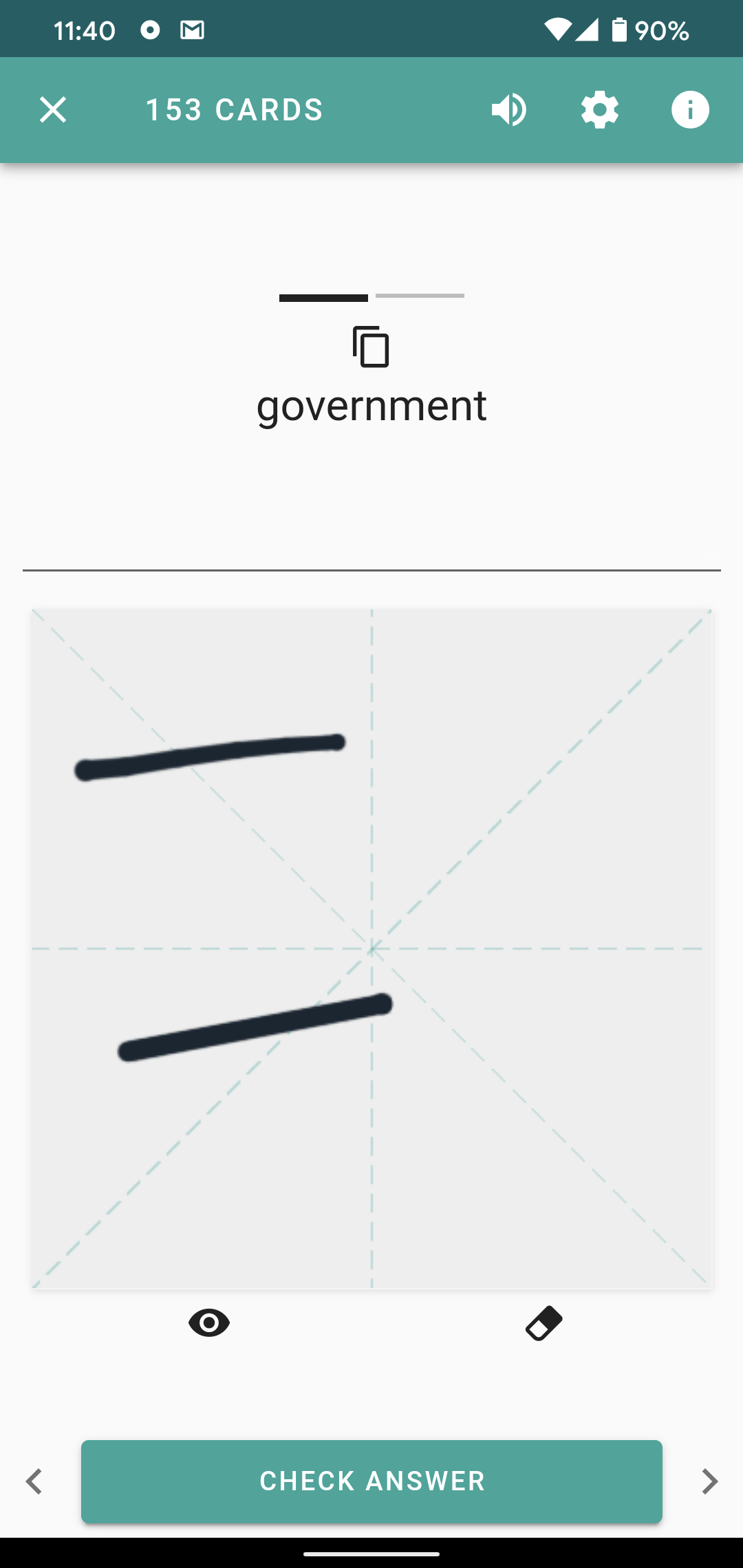
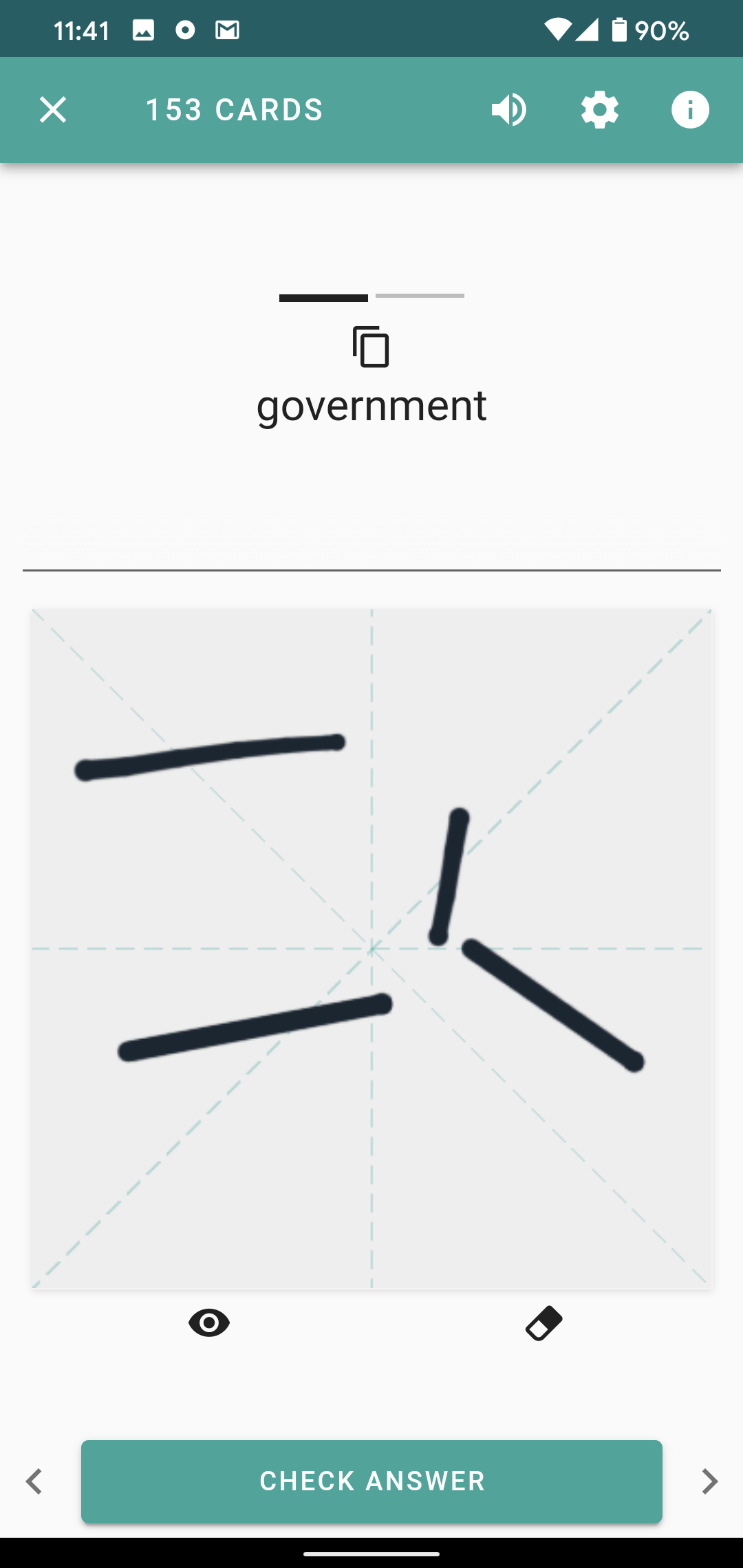
Swipe left on the top part of any study card and the example sentence will be displayed. You can even answer the card like a closed deletion prompt for writing cards.
Tap “show more” to see the reading and definition.
Hope this helps.
Thanks for the update, the latest interface adjustments go into a nice direction. Still the navigation of the info screen is a bit complicated. Maybe you could consider supporting swiping in and out of info screen and between panes? Like dragging the info screen in from the right.
Then one wouldn’t have to shift the phone around in one’s hand to reach the different navigation buttons which are placed in different locations.
Also, since you already have the characters shown on top of the info screen, how about accessing the single character breakdown directly from there instead of having to scroll down the info screen?
Anyway, in my opinion the new update improved things quite a bit. Maybe eventually there could be given a more unique, calming, “ethno” feel to the new app eventually (the legacy app has this soothing feel to it). It feels just very simplistic and “cold” so I always enjoy using the legacy app despite the new functions.
3 Likes
The old app had a very warm “wood and paper” feeling (like a writing desk in a library or study). The new “modern” look of the current app is cold and sterile. I’d love alternate “skins”, but understand it’s functionality over form right now.
Aside: I’m still rooting for a future iPadOS layout that makes great use of landscape mode on a big screen and a left-handed mode. 
2 Likes
@SkritterJake thanks for your explanation, I was mistakenly swiping from the left or right side to the middle. But that also gave me the same idea as @kehrichtbesen.
I think you can keep the current left and right swiping gestures for the top, but also add 2 new swiping gestures for the left and right bottom side to the middle. This can bring in the information of the info sheet, example sentences or whatever. Ideally, all swiping gestures should offer the option to individually customize it, so everyone can adjust to their own preferences. The more I think about it, the more I actually like the idea. That would mean you can provide 4 swiping gestures in total which is very handy. Especially having them on the right and left bottom side would be a huge help for one hand mode. You should definitely think about it.
PS. You can also reintroduce the previous “tab” option which opened the example sentence and mnemonic. That would then even offer a total of 5 options.
Agree whole-heartedly. Legacy Skritter very appealing visually.
Also legacy has more space for writing and the characters above the line are bigger, a bit easier to read quickly.
Can you upload a screenshot of your current canvas? Tweaks and adjustments are certainly possible.
Making sizes work across all devices is a bit of a challenge so we’re playing it conservative for now, but want to offer more control over sizes in the future.
@SkritterJake. Here’s how the current production app looks on the 11” iPad Pro (2018 model). Tiny tiny characters at the top, tons of open white space, and lots of white space around the drawing box at the bottom.
Plus, a pet peeve of mine is that for a long Skritter session, “holding” the iPad in your hand is too heavy, so instead I find myself balancing the iPad on my chest and just support the back of the iPad with my hand. The result is that the bottom button controls are almost unreachable. They are too low down, require a LOT of motion to reach, and frequently get blocked by the cloth of my shirt folding up a cm or so over the screen. For a large tablet, it would be better usability to have the grading buttons just below the middle break-line…much more reachable and ergonomic.
Or some nice landscape mode!
Since I’m left-handed, having the “i” button on the right is a pain because I have too reach over and up up to the far corner. And I use the button to get into Pleco a LOT. So, it’s annoying.
Edit: plus, remember, corner-to-corner, this travel distance is 11 inches of motion. Even while holding my Apple Pencil (which works fantastically with Skritter!!), the distance makes the usability feel tiresome, such as when you get something wrong, then hit the “forgot” button, and then want to go into Pleco via the “i” button. It’s not at all like using it on a small phone, where you can reach with extending a finger. Instead you have to move your whole forearm to reach.