I tried the Chinese Android beta today. Some things I noticed:
-
Playing sounds after completing each individual character is super annoying.
-
More importantly, the sounds played after completing each individual character are frequently wrong. Pretty much every word ending with a neutral tone is wrong, as well as others where there are multiple readings (e.g. 暑假 is shu3 jia4 but IIRC the 假 sound clip was jia3).
-
Something about the snapped-stroke animation on writing cards is slower. Going stroke to stroke and character-to-character feels sluggish compared to the old app. Not pull-out-my-stopwatch slower, but perceptible.
-
The hanzi/definition part of the tone question prompt is smaller, and barely readable for complex characters. The hanzi wasn’t super large before, but you almost have to squint to see it now. Also, both were previously centered on their own lines, making them easy to pick out, but now they share a line requiring more scanning to find the information you want. This makes the tone quizzes a real pain. The un-toned pinyin isn’t enough to know the tones, nor is the single character you are looking at. Maybe with both you can do it. Ideally you could just look at the word, but it is buried in small type in a variable location, as if you’re not supposed to be looking at it. In short, the most useful information is now the hardest to read. That makes no sense, and is a major usability problem.
-
Havingpiyinsmashedtogethermakesitabitofaneyechart.
-
The tone mark over lü collides with the umlaut.
-
There is a lot of wasted space in the UI. There is a small amount of unnecessary border around the drawing area, and then a huge amount of internal margin when showing the shadow of a character. Some controls were removed – conceivably a shrewd choice to reclaim space – but then others were moved from the (now larger) tool bar into the question area cramping it again. Forcing things to be smaller impacts readability and therefore usability.
-
Occasionally I would finish one character of a multiple-character word and it would skip over the next one entirely.
-
Meta: Making the beta a different version of the same app really disincentivizes me from trying it. If I could have it installed at the same time I’d be more willing to try it.
A couple screenshots to illustrate. Skritter “Classic”:
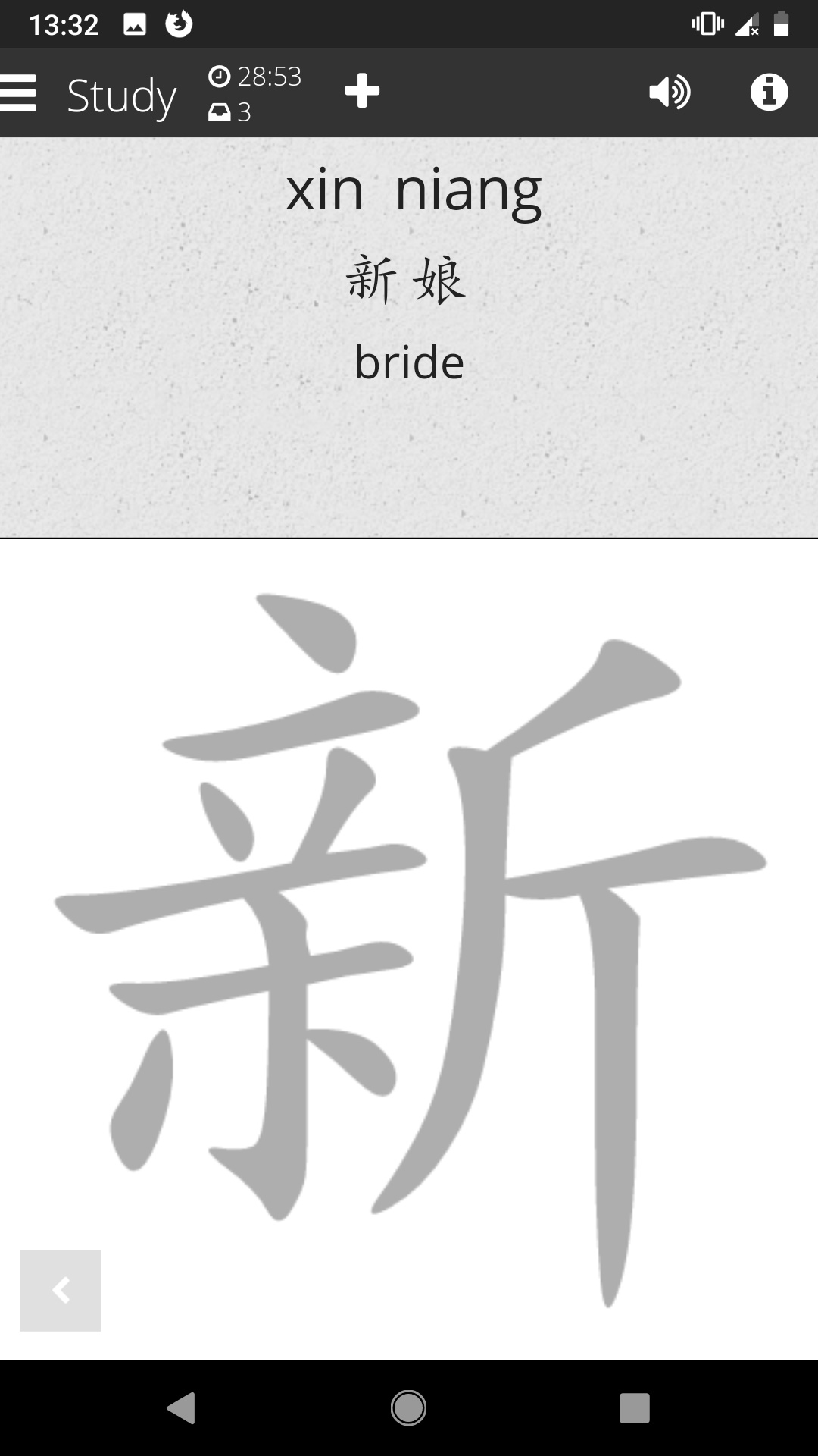
The hanzi prompt is sufficiently readable, though larger might be an improvement.
Beta:
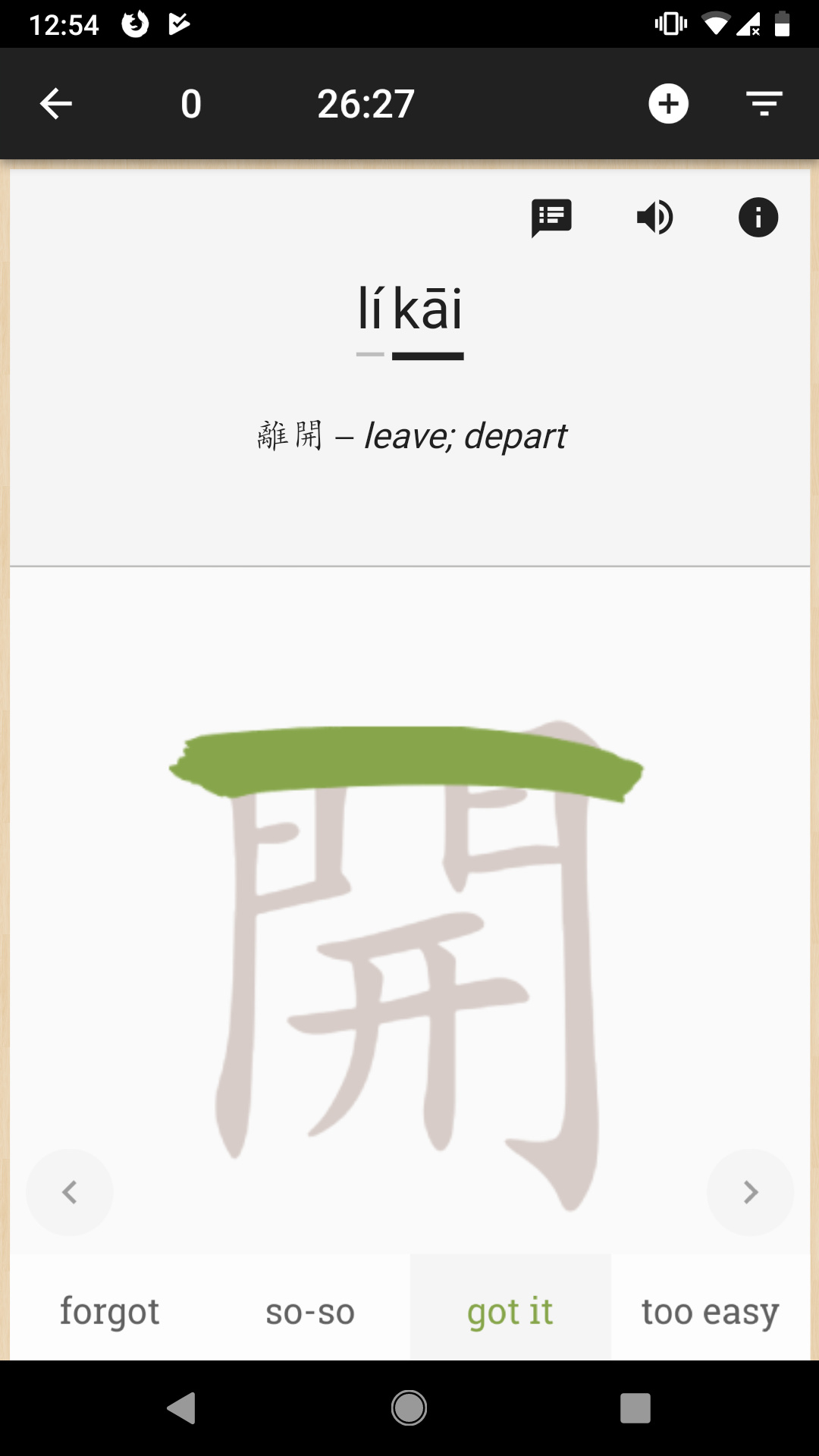
The hanzi word is not quite half the size as before, but is close. Complex characters are getting hard to read, and being adjacent to the highly variable English definition size means you have to look for them in different places on each card. The canvas’s decreased size and increased margin means smaller prompts there. Before I felt like I was wrapped in a cozy Chinese blanket. Now, ironically, the elements that correspond to the #1 thing I use Skritter for – written Chinese – seem to be playing a diminished role.