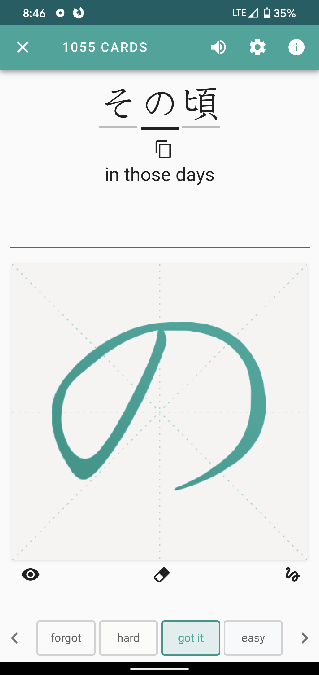
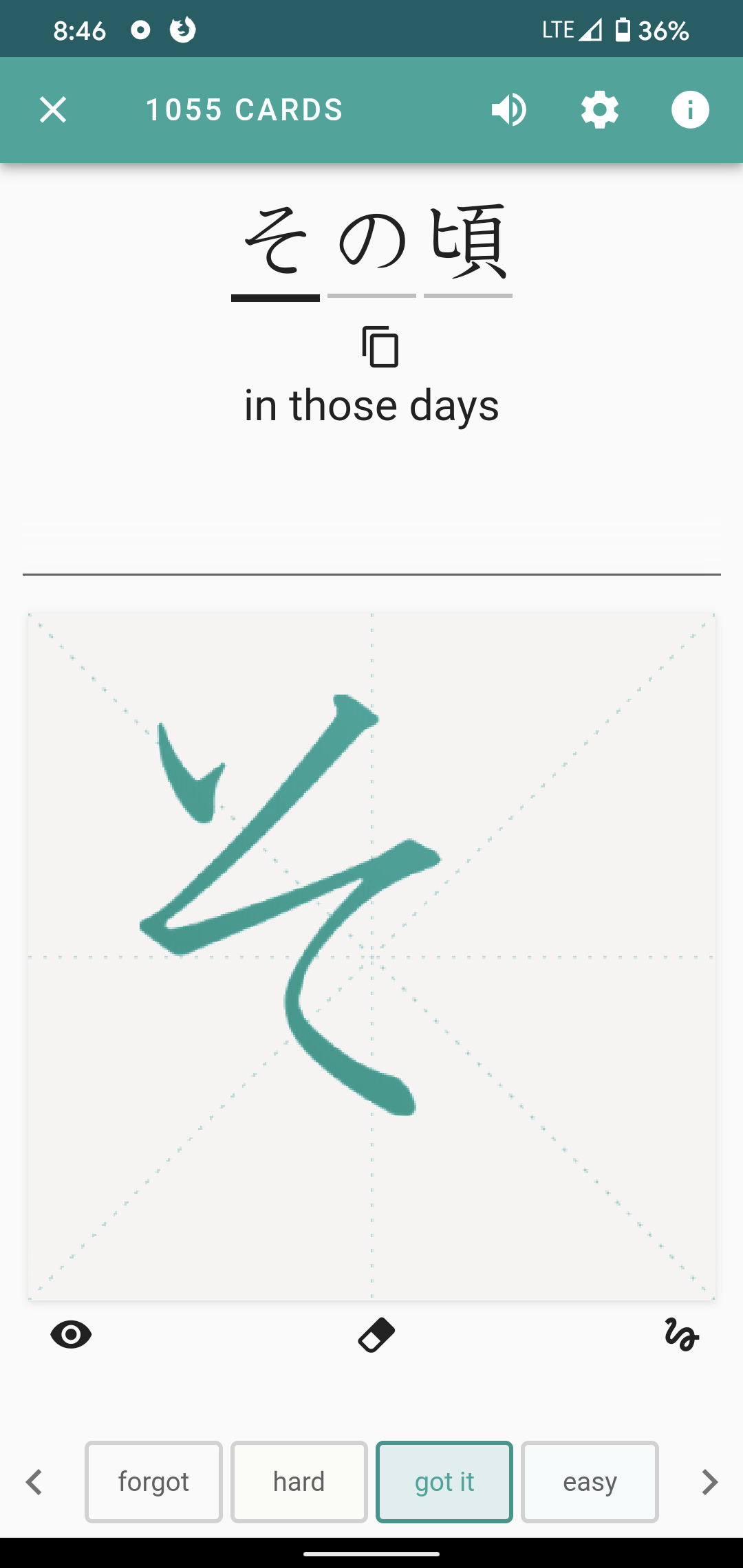
It doesn’t come up that often, but when it does I wonder why the letter そ always ends up scrunched up on the left of the canvas:
In comparison, here is a nicely centered の:
It doesn’t come up that often, but when it does I wonder why the letter そ always ends up scrunched up on the left of the canvas:
In comparison, here is a nicely centered の:
Looks like it needs to be repositioned. @Jeremy make it so!
hmm, the graphics for these were updated and そ uses a 1 stroke version now. We’re not sure how you’re seeing this! Would you be able to delete / reinstall the app and let us know if you see updated graphics? If not, would you be able to confirm which version of the app you’re using?
This appears to be a “basic canvas” issue. If you run the non basic canvas (toggled in the study settings) you’ll notice new kana strokes, better recognition, and much better alignment.
Fixing the issue on the basic canvas is likely going to require a fair amount of time and energy. I’m making a note of it, and I’ll open a report.
Interesting.
I use the basic canvas because the default canvas’s visual sugar is distracting, and the interactive performance is less smooth (on a brand new Pixel 4, which is no slouch). As far as I’m concerned, the “basic” canvas is simply better. I didn’t realize the differences extended to the content and recognition – that’s disappointing.
Hey @powelliptic, would you mind taking a short video showing the performance problems on your device when using the default canvas? What feels less smooth to you? The drawing, the animations, etc.? There shouldn’t be any performance issues on a device as new as yours.
The positioning and scale of the basic canvas kana can be fixed too. That won’t take as much work as @SkritterJake might have thought. 
I was glad to read this when I woke up in the morning ![]()
@powelliptic we’ll have updates to the kana positioning and stroke tracing animations in the next build that comes out!
I don’t have a good way to take a video, and when it comes to performance, the differences are slight.
One concrete difference is I noticed is somewhat coarser segmentation of strokes, as if it is unable to sample as frequently. That makes sense – it is doing more – but none of that “more” matters to me.
Glad to hear the characters can be updated!
One feature that’s currently missing (and planned) is to add bezier interpolation between control points, which should get rid of that linear segmentation you’re seeing. There’s other features that rank higher in priority right now, but I agree, smooth lines add another layer of satisfaction to the writing and are something we want to add to the new canvas.
Additionally, we will add in more features to disable the flashier streak effects in the future.
This topic was automatically closed 30 days after the last reply. New replies are no longer allowed.