This is complicated and this answer will be long, but I’ll do my best to sort it out. For a more thorough discussion, please refer to this article I wrote a few years back.
Tl;dr: Yes, it’s at least partially a font issue, but it’s much more complicated than that. Sorting out and displaying all characters correctly is something we are striving for, but we are currently prioritising other areas of the app.
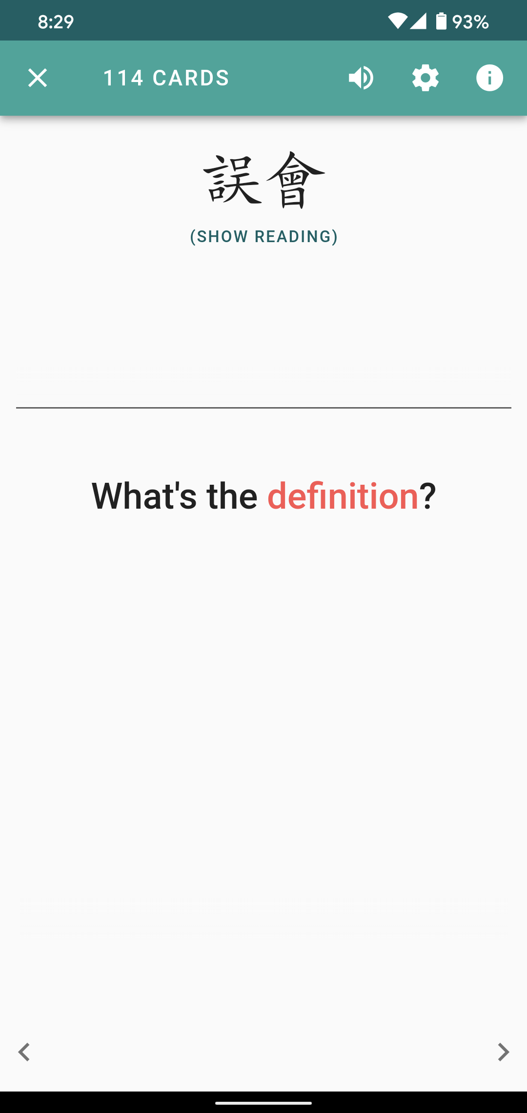
To start with, how characters are rendered in text (so the prompt in Skritter, for example, not the canvas) is determined by what font is being used. We currently use the same font for simplified and traditional, which works most of the time, but not always. If a certain character does not exist in that font, it defaults to the system font.
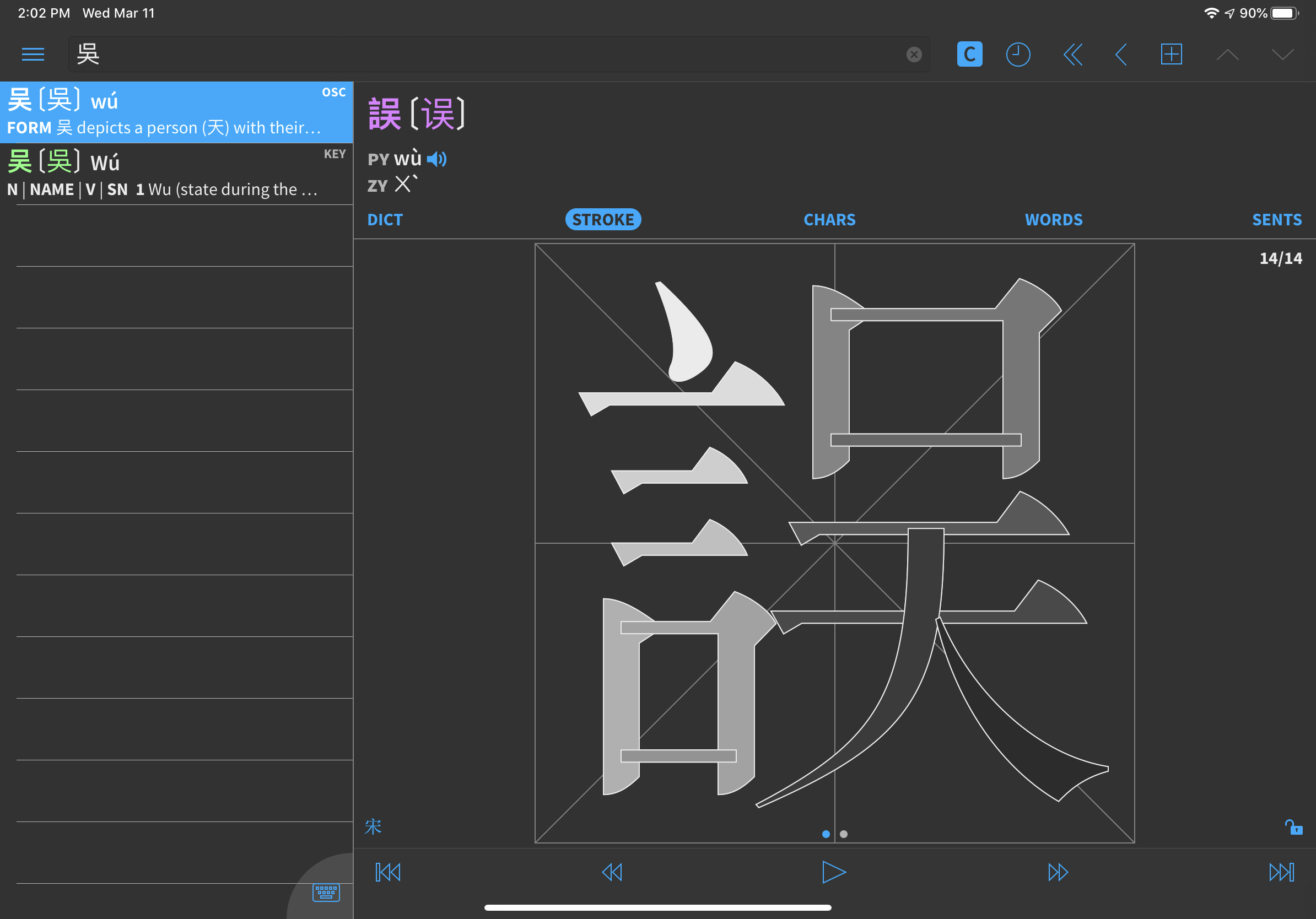
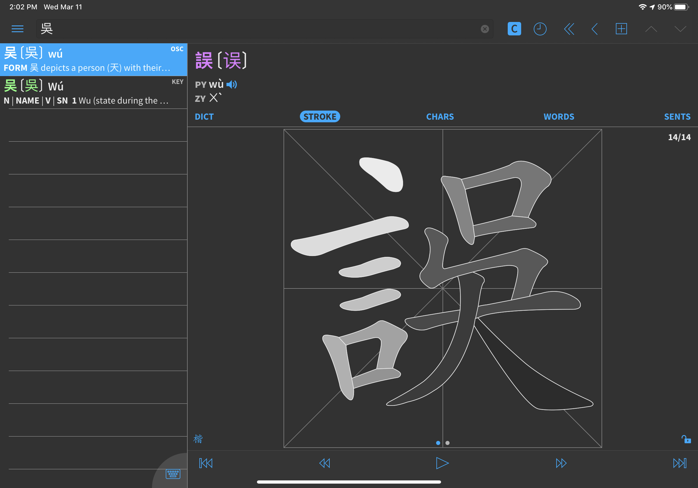
Some character variants have different code points, meaning that they are, from the font’s point of view, different items. So it’s theoretically possible to have a font that shows 吳 and 吴 differently (if they show up as being the same, the font in your browser does not make a difference between them). Here’s a picture so you know what I’m talking about in case they look the same for you:

So, in a sense, this is similar to separating simplified and traditional characters, which is obviously not merely a font issue. It requires both that the right variant is used and that both variants can be displayed properly in that font.
The problem is that these characters are not listed in any table of simplified characters. They are the same from an everyday, communication perspective; they just happen to be treated as separately on computers.
However, there’s a strong overlap with simplified and traditional characters and these variants. The first variant, 吳 is preferred in e.g. Taiwan and the second, 吴, is preferred on the mainland. But you can’t say one is the simplification of the other.
In your case, 誤 looks extra weird because it is obviously a traditional character that is being rendered with a font that can’t handle that particular component according to the relevant standard (Taiwan MoE, in our case).
So, what you’re seeing is a font that can’t handle all of this properly. To my knowledge, there are no such fonts that can handle both correctly (but if anyone knows of one, I’d be really, really interested in hearing about it).
One option to fix this specific instance would be to use a separate font when displaying what might be traditional characters, but that comes with its own problems and introduces its own inconsistencies, which I’ll explain in a bit. We do care about traditional (a majority of the team uses traditional characters), so this is something we want to fix. However, we also know that a very large majority of users aren’t studying traditional, so we’re prioritising other things that improve the experience for all users before fixing this.
To make things even more complicated, there are characters that share the same code point, meaning that fonts (and by extension, computers) cannot, even in theory, differentiate between them.
For example, 骨 is always rendered with the small box inside the top box on the same side in any given font. In Taiwan standard, it should be on the right, but in PRC standard, it’s on the left. Since these are identical from the computer’s point of view, there is no way to render them differently, unless two separate fonts are used (one which only follows Taiwan MoE, the other which follows PRC standards) and switched between somehow based on context.
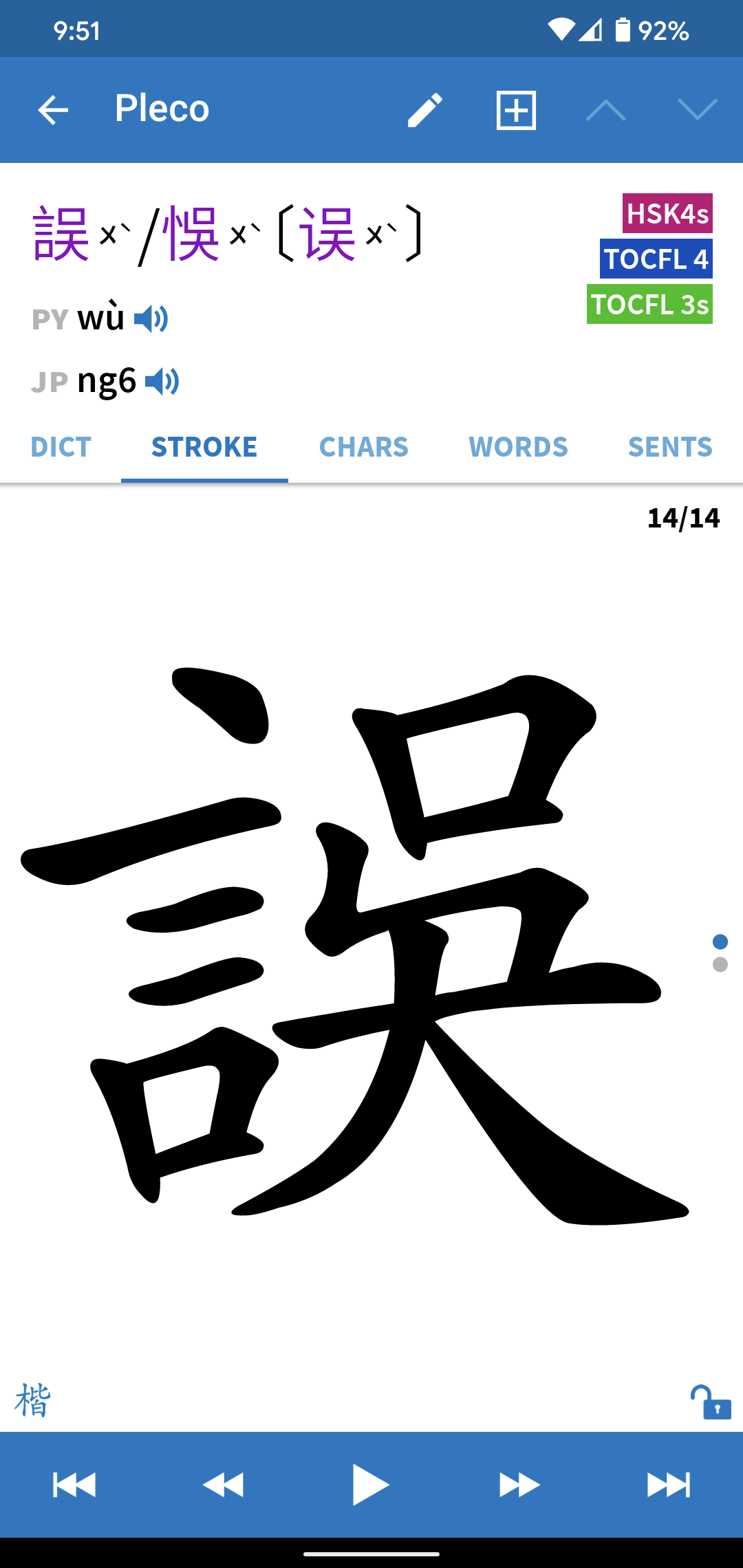
And this is where the writing canvas comes in. In theory, we can do anything we want there, because it’s not a rendered font, it’s a manually constructed collection of strokes. However, since we (and every other learning app I have ever seen) treat 骨 as being the same in simplified and traditional Chinese, it won’t work, because the box is supposed to be on the right in one standard and on the left in another.
This makes things fairly complicated. For example, if you know 丰 (S), we don’t assume that you know 豐 (T), but it is safe to say that if you know 骨 (with the box on the right) you also know 骨 (with the box on the left). This is not a traditional/simplified split, it’s another split that largely (but not entirely if you include Hong Kong, for example) mirrors the traditional/simplified split. And of course, if you know 吳 you also know 吴.
None of this is insurmountable. We can and want to provide better support for this in Skritter, but it won’t happen right now because other things have higher priority. I wrote this answer to show that this is actually a very complicated question and it’s not just a matter of changing fonts or fixing an error specific to Skritter. These things can be fixed, but they require substantial changes to character-related data and how it’s handled and displayed! We’ve been building a system to allow us to bypass tricky font and unicode limitations like this, so this will be fixed eventually in the future.


