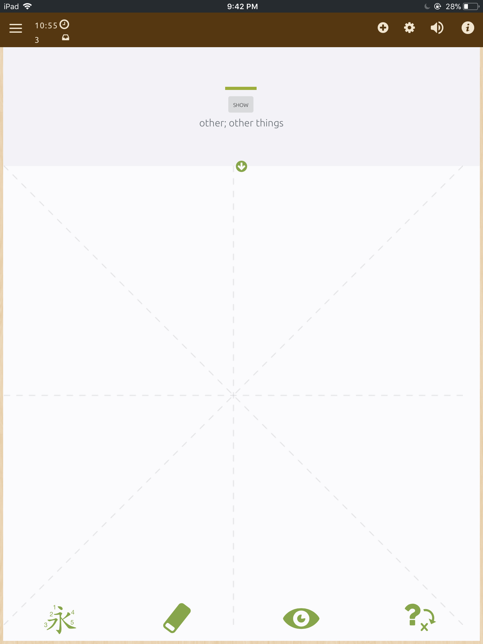
There are many items on screen that feel misaligned, or feel cluttered. Here is the base screenshot I’ll use to illustrate this view:
The items top left are the most obvious
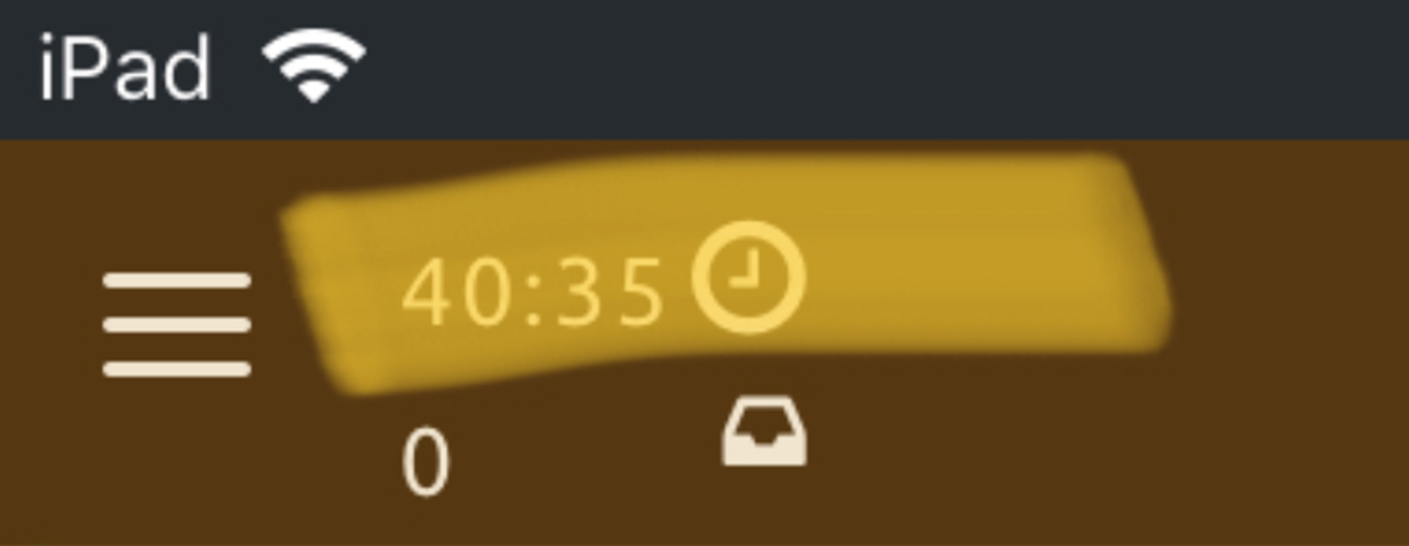
The clock icon, and the clock timer are not vertically aligned, which feels slightly jarring.
Also, the iPad has (relatively) a lot of horizontal space, there shouldn’t be a need to clutter the timer and the review(?) count together. I believe this can be leveraged in a better way by splitting them out to have their own section, side by side. This has the added benefit of making the items slightly bigger.
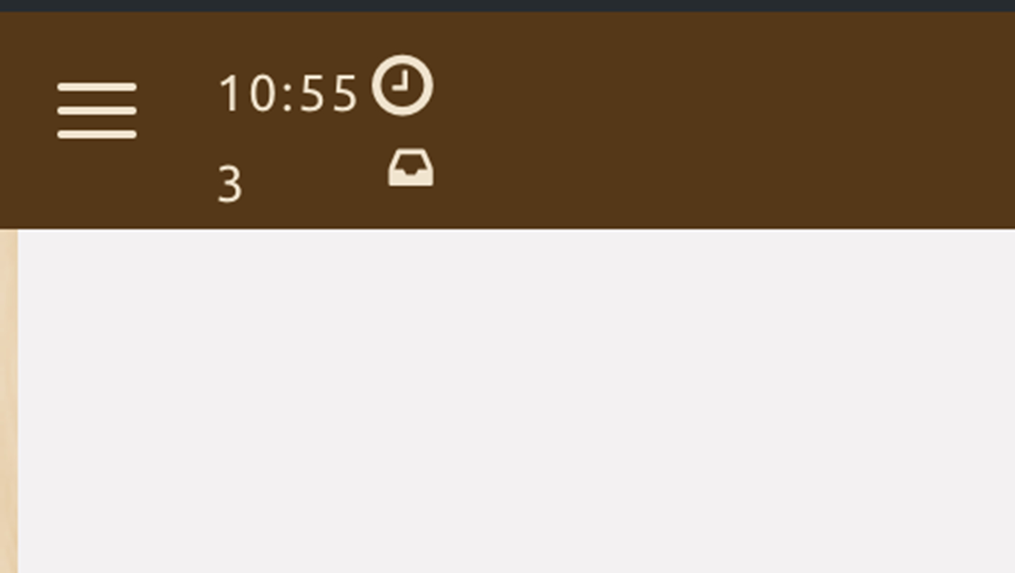
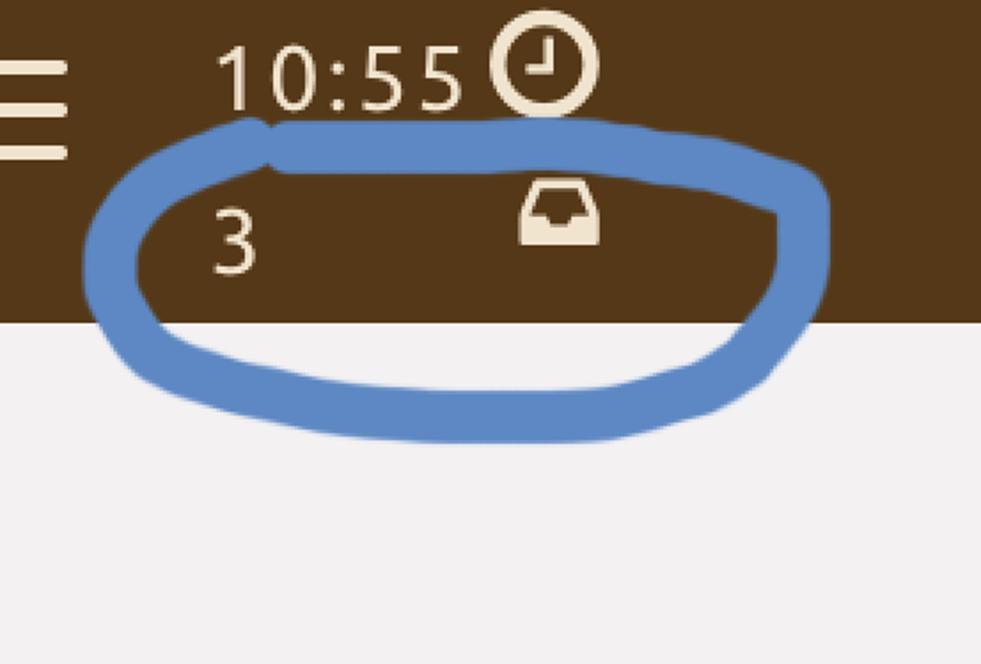
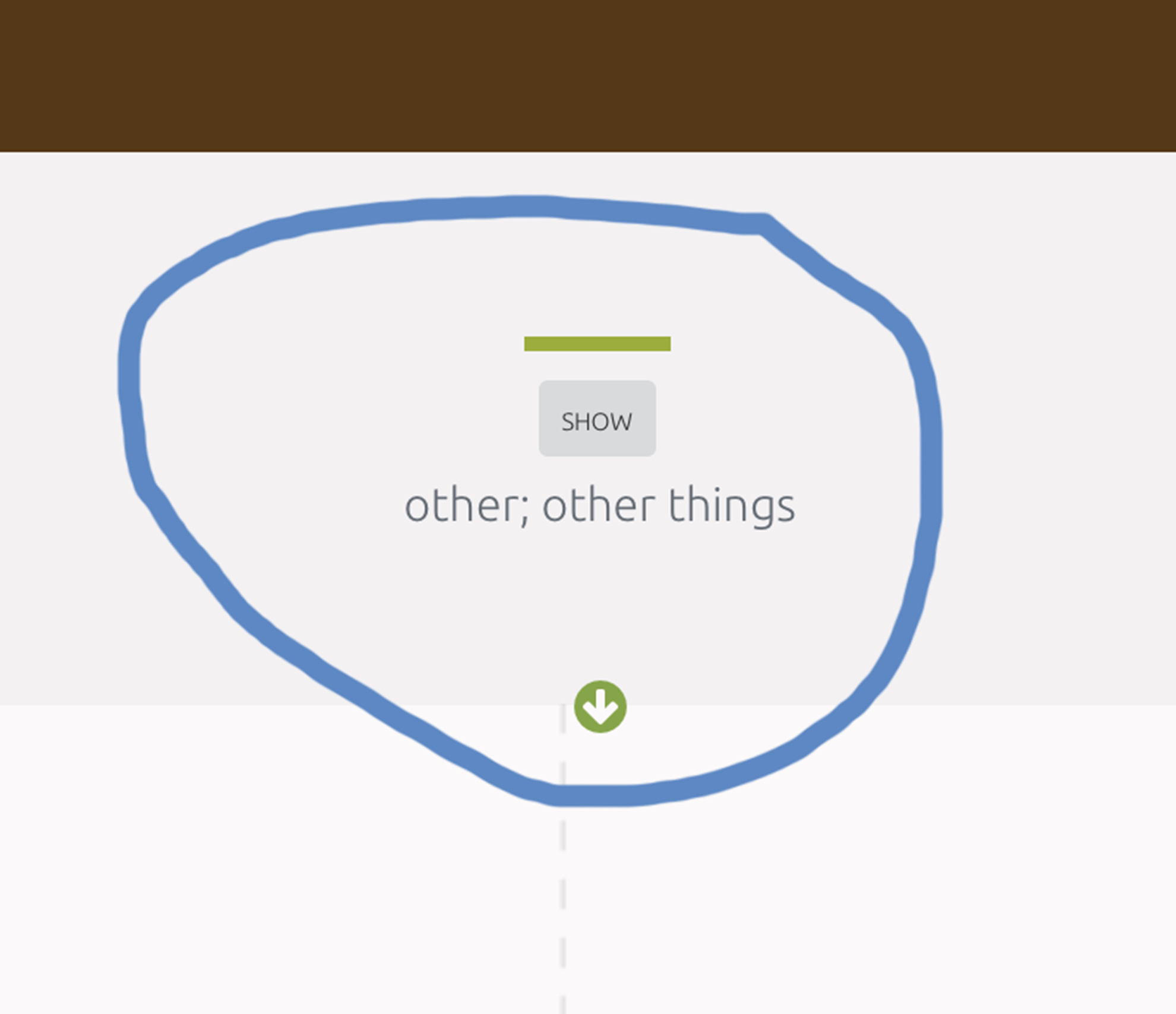
The other part is a slight usability issue, this icon and count:
I can sort of guess, and say “That are probably the items due for study today”, but frankly I’m not sure. I don’t feel the icon or the number is intuitive enough by itself to justify not adding text. Coming back to the fact that we have quite a bit of horizontal space I feel that adding text explaining what the item at hand is would be worthwhile.
Next up, the center of the page is not aligned with the center of the application.
There’s an arrow there, which should be used as a guide if possible:
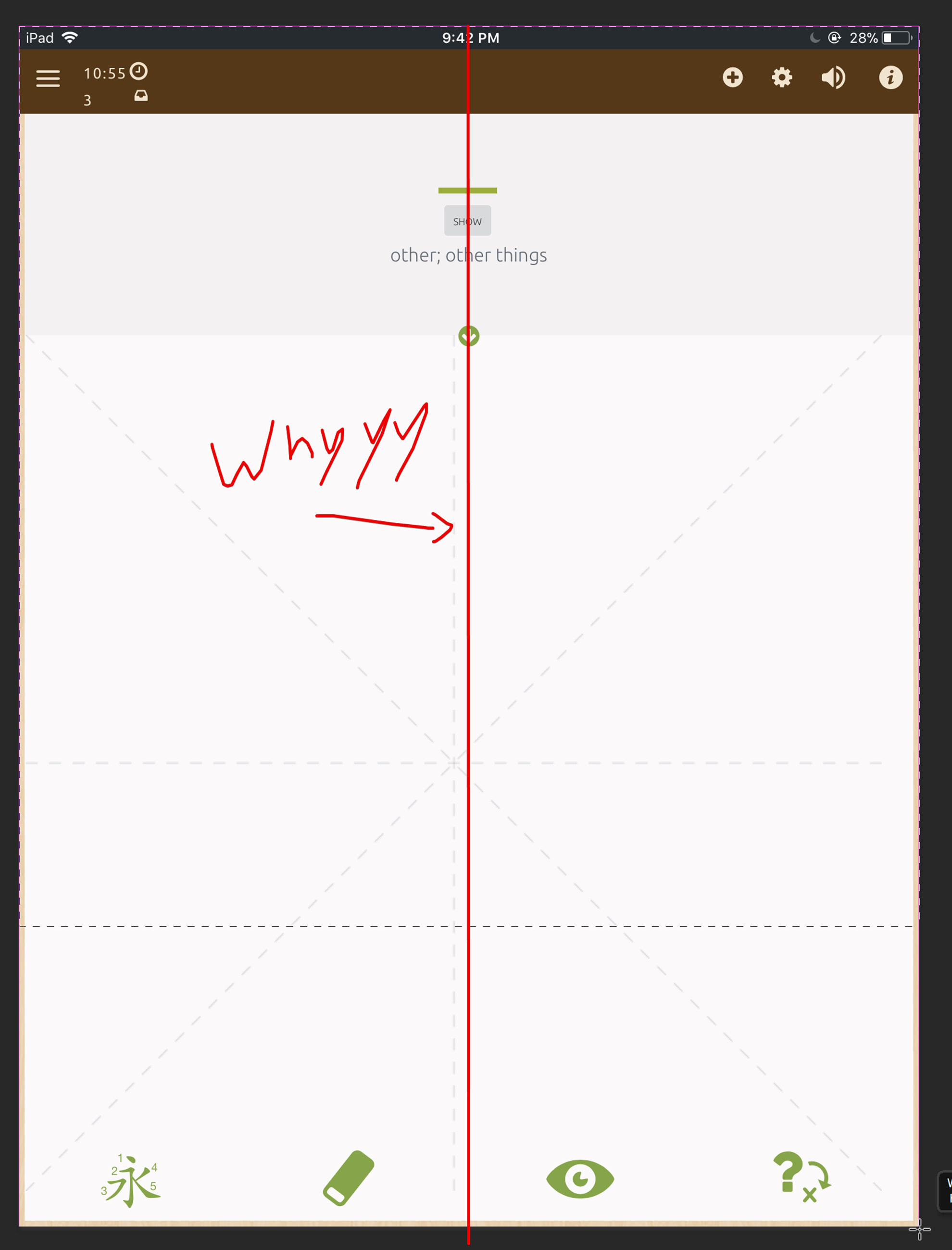
Another potential UX issue is the size of the font for the word definition. I think it’s a bit smaller than it needs to be, and the gray font with a gray-ish background makes the contrast very slightly poor. I think increasing the font contrast, or increasing the font size would be a good idea.
In general though, the application feels unresponsive (I feel there’s somewhere in the ballpark of ~.2-.4 s delay between clicking something, and the action happening), it feels like the writing engine got way more strict, there is no sound as there used to be between transfers (Where your entire word would light up the color you set, then there’s a sound that transitions you to the next word), auto transition to next word seems to take somewhere around half a second to kick in, which feels frustrating (Lack of instant feedback?). All in all I found the beta experience a bit frustrating.
I’d seriously consider delaying the iPad release while you hash out some of these. I am going to be uninstalling, and going back to the normal version for the moment.
I’m not saying this is bad enough that I would stop using the service if it shipped as-is, but it does feel like quite a severe quality impact from the previous application.
PS: The timer apparently keeps counting even while you are in the lockscreen: