Last week @josh came to visit me for a week-long Skritter Mobile hackathon. We made a ton of progress, and I wanted to share some screenshots of what to expect from the new mobile beta when it drops. We’ll have some more updates as we get closer to release of the app, but I’m very excited to share how things are looking right now.
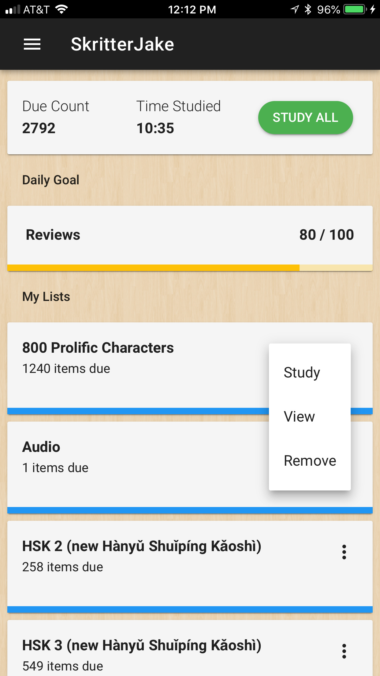
List study and management is getting a lot easier with this update. Basic queue management and single list study will be available right from the dashboard.
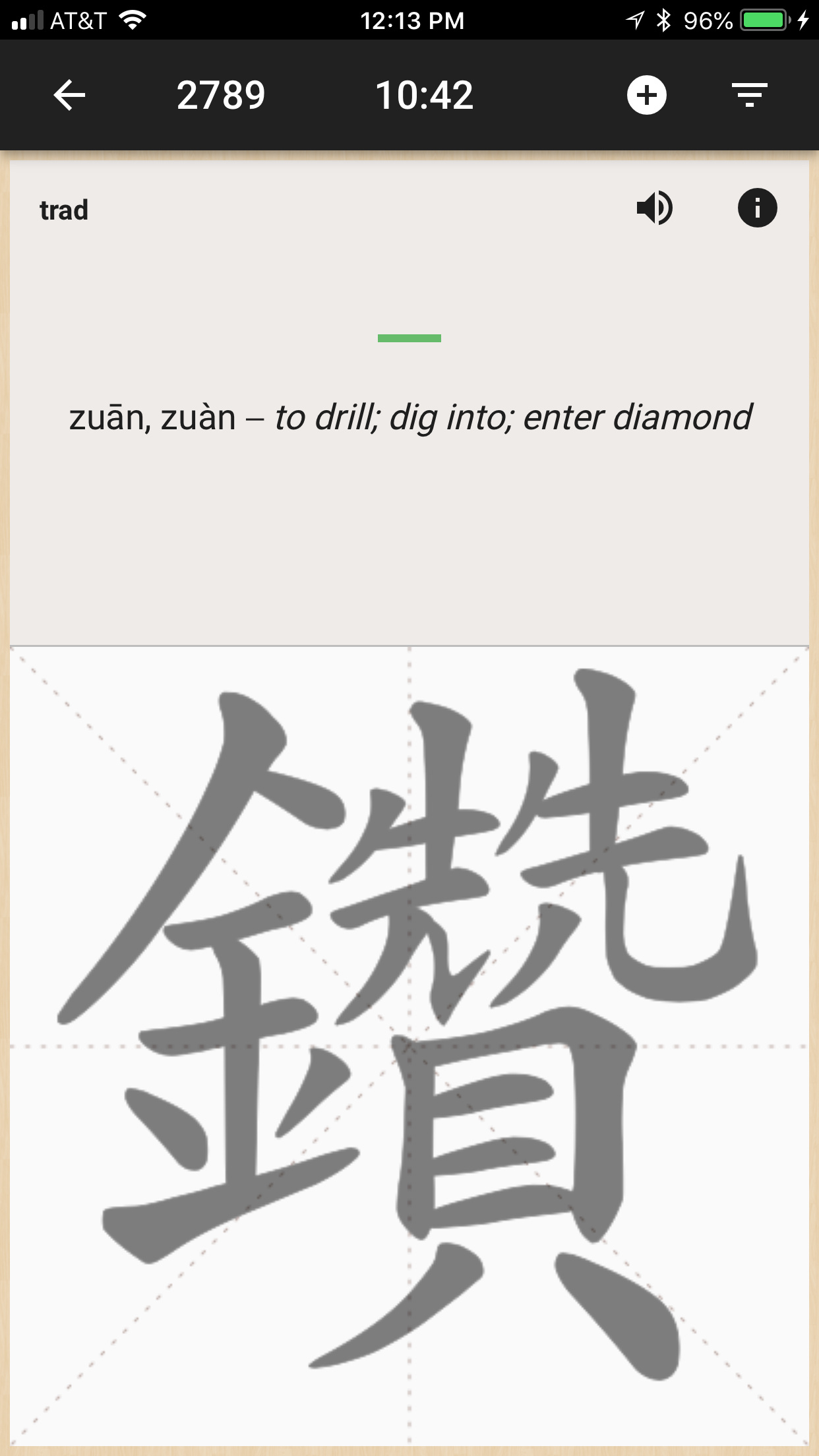
Study screen cards are getting a slight style update. Buttons/icons associated with the prompt will be separated from the main study info on the top of the screen. A few more buttons still need to be added back in along with mnemonics and sentences, but the general layout will look like this.
I’ve been exploring theme options for the application. While everyone’s favorite bounty hunter might not make it into the app (I don’t wanna upset Disney ) the ability to have a variety of themes and styles seems like a very real possibility, which could also lead to the custom theme creation in the future!
There are so many other minor updates and changes across various screens, and we’ll continue to update you all as we get closer to the release date.
Update sounds great! Question is: will this beta version be more stable overall than the current one? I’ve been going back and forth between the last updates and the super stable 2.1.2, but i always end up choosing the latter because my study queue keeps jumping to incredibly high numbers otherwise (600 reviews per day compared to my regular 100-150 using the 2.1.2).
The new features are nice and would definitely improve my study sessions of about 1h Skritter time per day, but not comparable to a 100% reliable app as the 2.1.2.
BTW, could it be possible to add an option that lets me hide the internal progress clock on the top or the one from android itself (full-screen mode). Maybe it sounds weird, but studying while being able to constantly see a clock that goes up particularly slow is demoralizing.
Great job in any case for bringing us new updates!
That’s the goal! This will be a good update to hop back on and give it a whirl again.
This doesn’t sound weird at all, I’m in the same boat as you. This has been talked about a bit and sounds like it could be a possibility some time in the future, possibly not having the timer on the study page but indicated on the dashboard.
One thing that I haven’t posted too many screenshots on is goal mode. Still very much a work in progress before it becomes it’s final form, but my goal (no pun intended) is to have the progress indicator replace the queue count and study timer info altogether so you can just focus on meeting (or beating) your daily study goal.
Looking forward to testing the new beta. Some notes on the screenshots:
font seems too small
there’s no example phrase?
I hope you will keep Pleco integration, it is extremely useful
I see you are putting a lot of effort into dashboard and settings screens, which is great, but it’s nowhere near important as having a smooth review experience. Perhaps it would be better to focus on this before venturing out into new areas? Regarding themes - maybe a dark mode would be a nice feature for some users, but other than that isn’t it better to have a single, coherent, branded experience? Same goes for too many settings - having too much choice is stressful. One of the best features of the 2.x app was it’s simplicity.
Example sentences will be in there. Mnemonics too. At the time of posting these images, we were still integrating our new batch of Skritter sentences and hooking mnemonics up to the study screen.
I think the screenshots don’t do font size justice. They’re looking pretty good during app testing, and we can certainly adjust them if necessary.
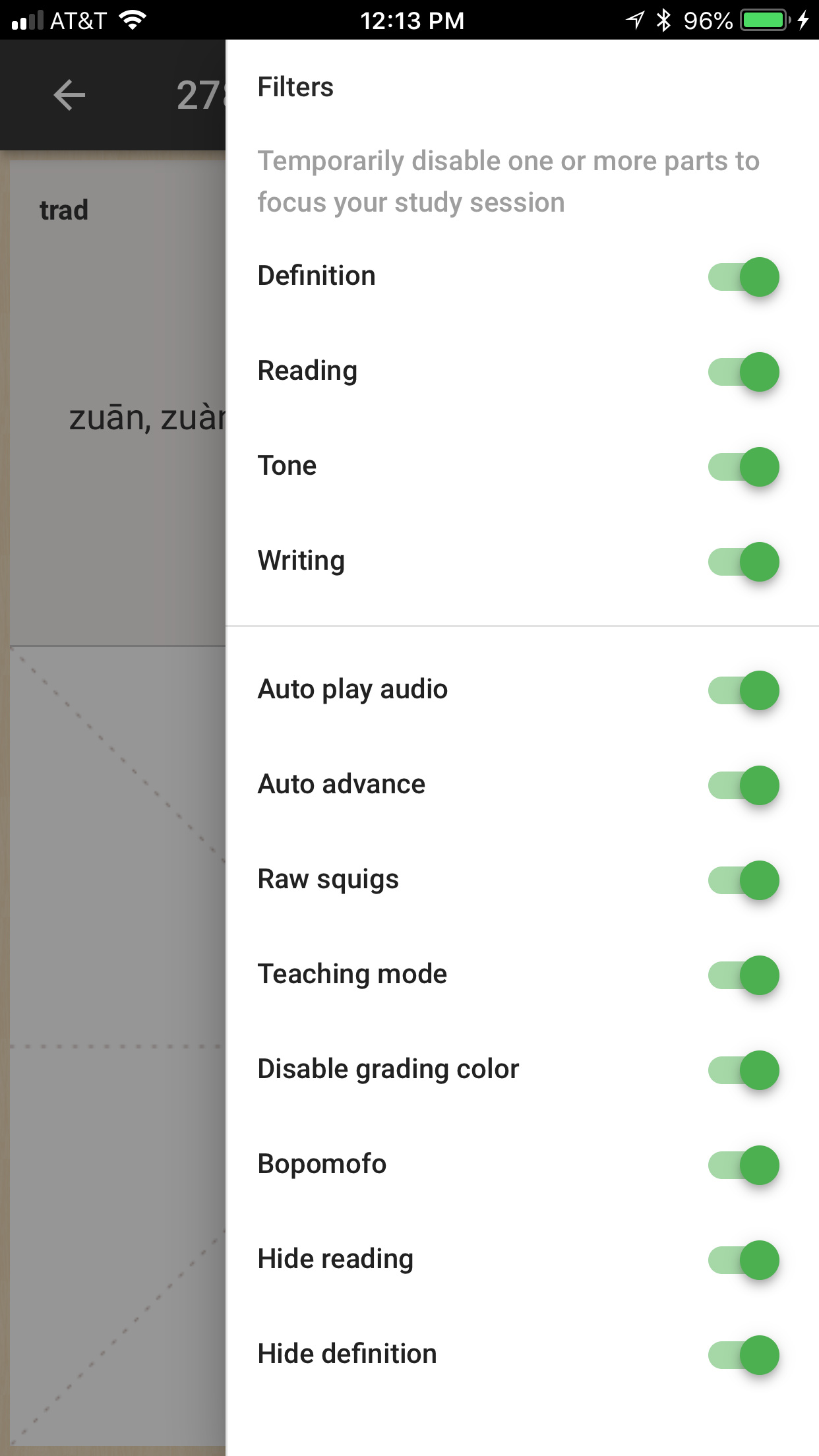
As to simplicity and settings, we’re offering mostly the same as current non-beta apps. Wanting to toggle raw squigs on/off, for example, shouldn’t force you to leave the study screen, go to settings, nav back to dash and click study again. Wanting to narrow down your session to be writings only shouldn’t force you to leave the study screen, go to Advanced Study again and reload everything. We put them in one place to make it easier to customize the experience.
The filters and quick settings are there for those looking for additional levels of control. I also don’t think the filters and quick settings screen will look so crazy when all the buttons are not toggled on (those settings would be crazy!). Since our app is more of a review tool and not a golden path to learning, we’ve found it best to give users options to optimize the study experience for them. The default settings will be sure to focus on the goal at hand-- efficiently reviewing characters.
Pleco integration requires some custom code and is lower on the priority list. I’m not 100% sure it’ll make it into the first updated beta, but we’ll get it in there again.
And you’re absolutely right. Smooth review experience is key. If that doesn’t work, the rest of this stuff really doesn’t matter. Performance is the main reason we dropped the previous beta to build this one.
“Pleco integration requires some custom code and is lower on the priority list. I’m not 100% sure it’ll make it into the first updated beta, but we’ll get it in there again.”
That would be a major disappointment. Please ensure that no features get lost along the course of the development.
See I started Skritter on wacom tablet many years ago and got really convinced only when the iphone app came out. From a user perspective, it is frustrating to see that 5 (6? 7?) years later, we are still pretty much using the same app like in the glorious times of Nick & Scott, without any improvements on the same. I tried the beta a few months ago and reverted back after 1 day because it felt all wrong and slow, and the usability was much worse than before.
I do observe some changes now on these new screenshots, so let´s hope we finally get the look&feel (and response time of the app) which we are used to, + some actual improvements and new features (without losing any of the old).
Thats the plan! Pleco integration might not be in the first version of the new beta, but one of the major points of this project is to give us the ability to roll out frequent updates and make improvements to the app we all love. It’ll be back in there for sure!
And I was around for those glorious days. iOS launch, which happened on June 12, was probably one of the most stressful birthdays of my life. Haha. Lots of customer support needed for the blank screen for non-Skritter users. And I remember doing lots, and lots, and lots of version testing on the iOS beta before it came out. Incremental improvements is our best way of pushing things forward.
There might be a few things missing in the initial release, but we’ll be knocking them off the list as we go. First priority from our side is making sure the Study screen, account sync, and offline mode are working as intended. If those things don’t work, you’re probably not sticking around the beta long enough to press a Pleco button, ya know?
Also, as I mentioned, we’re releasing this as a new app in the store. The two apps are very different, and we wanna give iOS users the ability to switch between the two while we adjust, tune, and collect feedback along the way.
I signed for the upcoming iOS mobile beta discussed in this thread. This morning I received TestFlight links for a beta released on April 24 (version 3.0.4). Can you confirm if this is an OLD beta, and not the new beta discussed here?
The line item that attracted me most is that the new beta would be a separate app from the classic iOS app. I’m not ready to get rid of my current iOS classic Skritter Chinese (warts and all), but would still like to help beta test. So, I want to make sure I’m not going to delete my old app.
That would indeed replace the older app, however you could uninstall it and reinstall the non beta version. It sounds like you might want to wait until the new one comes up (separate from the older app, so you could keep both installed)!
Quick peek of the app in action. We got iTunes Connect working today and we pushed out the first test build from TestFlight. Forgive some of the bad strokes in there, I actually got a bit nervous writing since I knew that the screen capture was going.
A few things to note.
Automatic grading isn’t hooked up in this version but will be working for the beta release.
We have done no actual adjustments for landscape mode on phones just yet. Again, on the list.
We have a hit list of strokes that are a bit too hard to write and we’ll be adjusting them all to make writing that much smoother.
More updates and an official teaser cut of the app will be coming out shortly. It’s getting there!
 ) the ability to have a variety of themes and styles seems like a very real possibility, which could also lead to the custom theme creation in the future!