Skritter Android Beta is out and we're looking for feedback!

OK, another couple of minor issues, they might be reported elsewhere for all I know (is there a proper bug tracker anywhere?):

Volume control only affects media volume while sounds are being played, otherwise, they affect ringer volume.

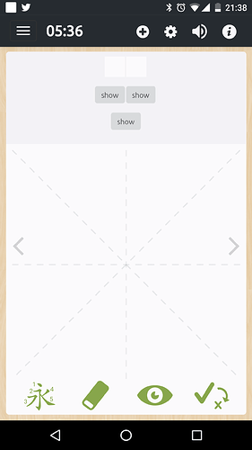
With “hide definition” checked, you also don’t see the word you’re supposed to write (I think this might be the same in Skritter 1), see screenshot:

Android 7.1.1 on a Nexus 6p

1 Like

There’s an open issue for the volume control. It’s okay if you report something already reported, we appreciate it!

It looks like you might have the “hide reading” and “hide definition” option both enabled based on your screenshot-- would you be able to check?

Hi guys!

Long message, with the bad news first, 'cause that’s how I experienced it, but the end is hopeful.

I just tried the beta on my old Lenovo Tablet B6000-H running Android 4.4.2: it’s not usable. The writing is much too laggy. At least it loads up fast now. But even just writing the tones is too laggy. Outside of the writing and tones, the interface is I guess usable, but feels slow.

Guess it will be equally terrible on my old-ish Sony Android phone, I don’t even want to check… (see below, spoiler: I’m wrong!)

Sooo… my preferred ways to use Skritter remain:

  • iOS app (which even works fine on my old iPhone 4S, though I use it mostly on a new-ish iPad)
  • legacy web version (if only you would re-enable touchscreen support it would be great)
  • the old Android / HTML version (took forever to load, but was ok otherwise)
  • (current Android / HTML version: useless)

Sooo… my favorite ways to use Skritter are all scheduled for shutdown or replacement? Not good.

While I’m complaining, I’ll say it: I preferred the old forum: it was simple and friendly. I don’t like using Discourse: it feels impersonal and has lots of useless-to-me boilerplate. And it feels less active.

(It’s like there was a decision a couple years ago at Skritter to replace everything that worked pretty ok with newer, fancier stuff that actually isn’t as good… Second-system effect?..)

And now for the good news! It turns out the Android app works pretty well on my old-ish Sony Xperia C3.

(I do wish I could move it to my SD card as I am very limited in space. And I wish I could study individual lists because that’s how I study now since I have 7000+ items due and I think I will never get them done and just thinking about that makes me hate the very way Skritter implements SRS ;-))

But my first (well, second) impression of the current Android beta app is good, so I will try to keep using it. (But it’s unlikely I will use it much until I can study specific lists.)

Good luck and best wishes to you all!

Hey Kai, thanks for your feedback! We’re glad the app is running well on your Xperia, but not so glad your Lenovo tablet isn’t running the app well. As progress on the beta moves forward this will only improve. The app is still in the beta stage, which is why some things haven’t been implemented yet, however single list studying is currently possible on the beta app. (You can click the “Study” link next to the list’s name on the dashboard).

The second-system effect is quite the opposite of what’s going on! 2.0 is fixing a lot of things that were locked in stone, like overall speed, while incorporating all of the used features and eliminating things that are hardly used, which is the opposite of feature creep. It does however allow for some things needed in the past, like a teaching mode or handwriting kana, which are new features but not for the sake of being a new feature, those were highly needed additions. The idea wasn’t to take a working system and redesign it for the fun of it, it was a much needed step moving forward if Skritter wants to keep innovating.

The old forum might have seemed more inviting since it was built into the site’s interface, opposed to it’s own dedicated site. It also didn’t have different topic areas and all posts went to the same spot, which might make it seem like there’s more activity. I do see what you mean!

1 Like

You can click the “Study” link next to the list’s name on the dashboard

Yay! Very nice. I suggest you add such a button next to each list in the list of lists and at the top of each list’s screen so dummies like me don’t miss it. Probably you don’t need all the lists to appear in the Dashboard anyway.

1 Like

More feedback, then, before I forget it:

I find the “check mark with an arrow pointing to an X” a very confusing icon on its own. If I think about it, I sort of know what it is trying to say and do, but I really have to think about it. Usually I just think it looks weird and out of place and mysterious.

What’s really mysterious to me is how it relates to the 1, 2, 3, 4 scoring system. It seems to duplicate that functionality!

When I write a character, there seem to be three things that indicate my state of knowledge of the character (one clear thing would be sufficient):

  • the color of the writing (green unless I obviously don’t know it, then red)
  • the 1-4 numbering (not selected until I finish the character… uh, no, never marked if I get it right? so irrelevant for writing?! Ah, no, it does get marked 1 when I get a character wrong. So maybe it’s a bug that it doesn’t automatically get set to 3 when I write a character correctly? Ah, no, it’s because the 3 is selected and I just can’t see it, light-green being near-indistinguishable from light gray – maybe you should use bold in addition to color…)
  • the “check-mark - arrow - cross” abomination (yup, it’s time for strong words ;-)) Sometimes the check-mark is bigger, sometimes the cross is… I don’t want to even think about that thing, it makes no sense and seems redundant. Additional weirdnesses: no matter what state, it’s always green (green cross means… wrong but it’s ok?..) And when the cross is the main sign its size is bigger than the check-mark size when the check-mark is the main thing (so… check is fine, but cross is BAD, that’s why it’s bigger?..). Also, before I even start writing, the check-mark is the main thing, as if I already knew it, even if I’ve never seen it before.

Obviously this is tricky stuff, so good luck. I don’t claim to know what’s best.

FWIW here’s my stab at what would work for me:

I would prefer to only have the numbers.

And I’d like the automatically calculated number to appear as soon as you know it. I’ll still keep writing if I want to practice the character, but I want to make sure the system knows I don’t know the character. It’s weird having a delayed notification.

I don’t need the color of the writing to change. It’s a bit weird, the character can be written right, but appear in red, because I made mistakes along the way, or “cheated” and requested the preview. So the color doesn’t match the writing, it indicates my knowledge, but that’s what the numbers already do.

And I don’t hardly ever use any of the buttons at the bottom, so for me they could be smaller, or better yet optionally hidden behind a popup menu, with a text reminder of the writing-shortcut for each of them, like “swipe up to erase”, “tap once to see the next stroke”, “tap twice to see whole character” (“triple-tap for assisted mode”?)

1 Like

The check-mark-and-X button shows what the current grade is, showing a large check if it’s correct (and an arrow pointing to the X to switch it), and large X when it’s incorrect (and an arrow pointing to the small check to switch it). To me this seems logical, however the X should really be colored red to match the character color, and also not show the default image for it when the word has been manually adjusted using the grading buttons, but rather reflect the chosen grade even when only using the 1-4 grading buttons-- I’ve opened an issue!

The way the button works is by toggling from grade 3, to grade 1, and back and forth. The 1-4 grading buttons themselves are for fine tuning, by using a “so-so” (2), or “too easy” (4). The only times the 1-4 grading buttons would need to be touched is really for grading something as a 2 or a 4. The check-mark-and-X button can be used to quickly toggle something as correct which was mistakenly marked as incorrect, or to manually mark something wrong that was counted as correct.

If a character is marked red (even though it’s written correctly), it doesn’t mean the character itself is incorrect, but rather the steps to get to the finished written character weren’t considered correct or you wouldn’t have remembered it without peeking. (That’s why the character color changes depending on what grade it’s been set to, to indicate how well that character was remembered by what color it is).

The buttons at the bottom don’t have shortcuts for each, just the eraser and reveal. I believe most use the buttons opposed to gestures for those features as well, and they’re very handy being accessible right on the canvas since they are used often and needed to trigger teaching mode or quickly toggle a character’s grade, in addition to a quick tap to reveal or erase the character.

You are right, Jeremy. However, it is obviously pointless not to show anything in these cases. Personally, I think it makes more sense to show the definition when you should write a character, but I guess opinions may differ. Perhaps a solution could be to add another option when you hide both reading and definition setting which one should be shown if both are hidden and no character is displayed?

The reason why both options exist (and can be used simultaneously) is for cloze deletion style studying, which is dependent on example sentences but they haven’t been fully implemented in the beta yet. It should be that when both options are enabled that the example sentence shows on the study page itself hiding the word in question until fully written, which would make both options being enabled make a lot more sense, since currently you would have to navigate into the detailed information window to see the example sentence for the word. Otherwise you’re absolutely right, both options shouldn’t be allowed to be selected at once without a writing prompt having a possible method of knowing what to write. I’ve opened an issue!

I can’t add new words in the new app.

I study only from customized lists and today I found out the new version was installed in my phone… OK, but I can’t add new words from my lists.

In the previous version of the app, whenever I added a new word, it didn’t matter if I had thousands of pending words to study, I could immediately start studying the new word. Now I just get the confirmation message that it was added, but it keeps prompting the old ones.

An update to the app was pushed too early by mistake, we’re sorry! You can find the APK to the previous version here:
https://files.skritter.com/android/0.125.2750/5

(You’ll need to uninstall the existing Skritter app on your device before you install this one).

I’ve also added extra subscription time to your account to try and help make up for the mistake.

oops, sorry, forgot to reply. I guess we disagree. Here’s some more explanation of what I think, just in case it is helpful, feel free to ignore.

I think I could understand what all the buttons in the Android Beta do, my point was that there are too many of them, and in some cases they are ambiguous and redundant. Compared to the iOS app, the interface has been made more complicated, but this hasn’t always been an improvement.

The check-mark-and-X button is logical enough but too busy and strange-looking, unclear due to its color, out-of-sync with scoring (but that may be a bug as you say), shows info redundant with the detailed scoring and character colors, and provides functionality redundant with detailed scoring buttons.

The iOS app’s solution is nice because it uses a single, visually clear widget for all scoring, that acts like your new check-and-X button when single-tapped and like the more detailed scoring buttons when held down. The detailed buttons, as you say, are almost never needed, but they are unnecessarily shown for every item in the Android Beta.

The iOS app also gives me immediate feedback when it decides I have the character wrong (or so-so), instead of waiting until the end like in the Android Beta. (The iOS app, like the Android Beta, does wait until the end to change the color of the hand-written character, but that extra feedback has always been overkill in my opinion, though pretty enough I guess).

I understand that newbies and/or beginning learners are happy to see and use the bottom buttons. But I doubt more advanced users would want to see them all the time, when space on the screen is limited. So those nice friendly buttons could be made to appear only when you do a single tap, which is already the gesture for “help me, I don’t know what to do”. You could also have a friendly general contextual help button somewhere.

Speaking of buttons, one I do use a lot is the “information” button, which is too small and off in the top right corner. Because it’s so small, it’s easy to miss when tapping. There used to be a swipe from right option to display it, but it looks like it’s gone. It wasn’t that convenient anyway.

And speaking of the information window, it can be very slow to display if the network is slow or whatever. That’s ok, often I just want to access Pleco anyway, but what’s really bad for me is that it doesn’t display anything while waiting to download the info. I’d rather not have to wait to be able to press the Pleco button, which does not require network access.
2 Likes

I guess this is probably reported somewhere, but the app frequently just about grinds to a halt while adding new characters, you can go back, access information etc, but pressing the “next” (>) button doesn’t do much.

This is a good point and we’ll consider replicating this like how it works on iOS.

I’ve opened an issue, if possible the Pleco button which doesn’t rely on internet access should display without having to load any data.

This is something we’re working on improving! If the data for the next prompt hasn"t loaded yet, the > button won’t advance the next prompt right after tapping it, but will advance once it’s able.

1 Like

A UX issue: when you tap the menu button (three horizontal lines on the top left), the menu slides in from the left. Now, where the menu button was, there is suddenly a log out button, that will log you out immediately without prompting. I’ve been bitten by this twice now, and it’s annoying. It’s easy to tap it because it’s where you expect the close menu button to be (which doesn’t exist), and it’s easy because sometimes, there’s a slight lag before the menu opens, and you might tap again because you’re unsure whether you hit it or not, at which time it can have turned into the log out button. In addition, the symbol isn’t obvious and can be misinterpreted to mean “close the menu”.

1 Like

The dictionary link is bugged atm. Clicking on the hanping link will open hanping but search for the item “null”. Also the pleco link is gone again.

I’ve opened an issue for this, thanks!

It looks like there’s an open issue for the missing icons, thanks!

Great, you added a prompt! Pressing the cancel button doesn’t do anything, though, but you can press the X button in the top right corner to do so. :sunglasses: