Actually, I think that might have also been the case with the old beta; it was just less noticeable since there was no card for that direction at all. Hopefully it will be fixed with the upcoming “don’t display x/y/z” options.
Beta is completely unusable for me.
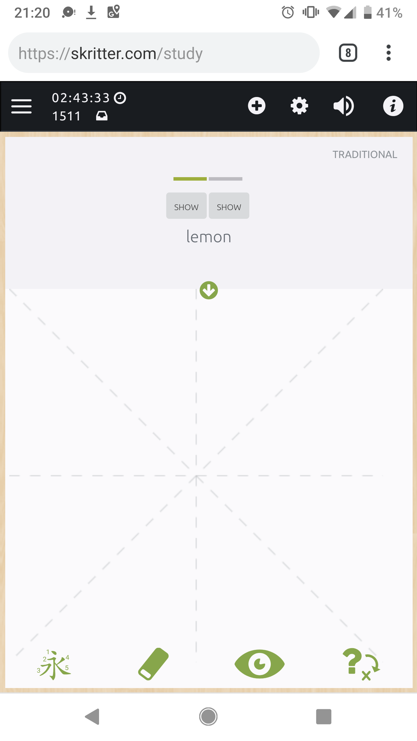
- writing area too small
- hanzi -> pinyin does not include translation in info button
- pinyin -> hanzi does not include translation (how am i supposed to guess which hanzi it is if there are many with the same pronunciaton?)
Sadly the past days the old app has been continuously going out of sync, resulting in many reviews that are lost, so they are stacking up. And it’s annoying to study for half an hour and then repeat everything again. So now both versions are unusable.
1 Like
While I don’t find the writing area to be too small on my phone; I do feel the bumpy paper looks dirty on the new clean interface. I would like a cleaner look for the writing area. Maybe getting rid of the crumpled paper with white and using the turquoise color as a border would look nicer.
1 Like
example of the out of sync issue.
i did couple over a hundred reviews today and.nothing has been .synchronized.
After some more study I have some more observations:
-
Has something about the way reviews come up been changed? When I woke up this morning I had 1200 reviews due. With the old app, to completely clear this would have required at least two hours dedicated, sitting down, and powering through them. Today, I somehow managed to clear them all while doing other stuff. It used to be that when I closed the app and reopened it maybe am hour later, I’d have 30+ extra reviews due. Now, the number stays the same.
-
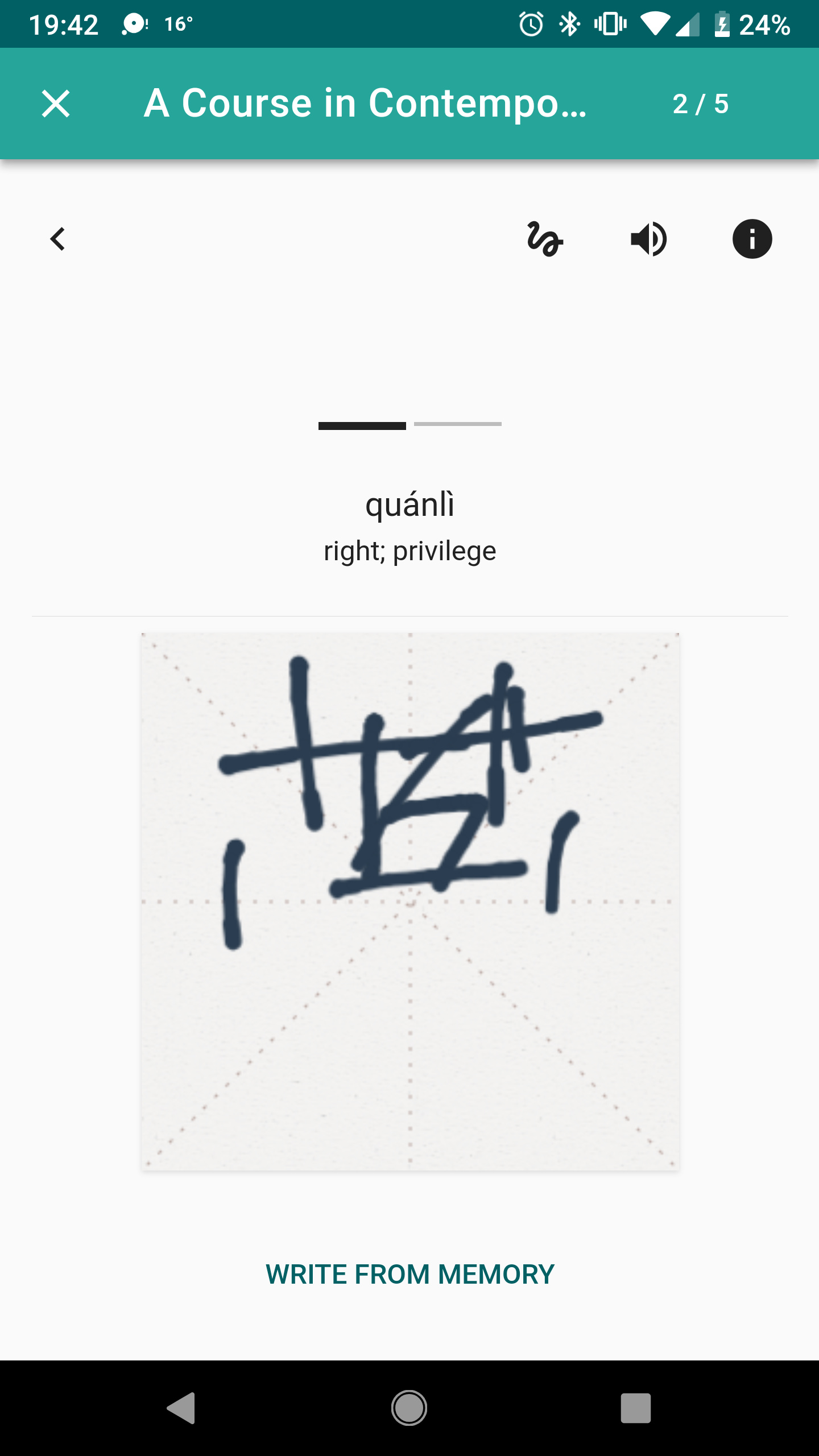
In learn mode, it has you trace a word twice and then goes straight to raw squigs, which has always been a mode that I dislike because it isn’t very sensitive (resulting in lines in the wrong place making what I write being completely wrong) and no way to correct it. It actually seems to have gotten worse here. Basically, I think the option to use raw squigs should also extend to learn mode and you either completely have it or you don’t.
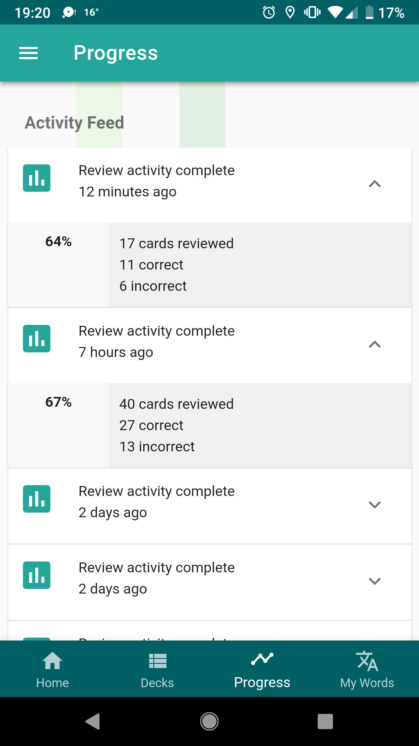
- Under progress, it doesn’t show today’s stats at all, and keeps them at 0.
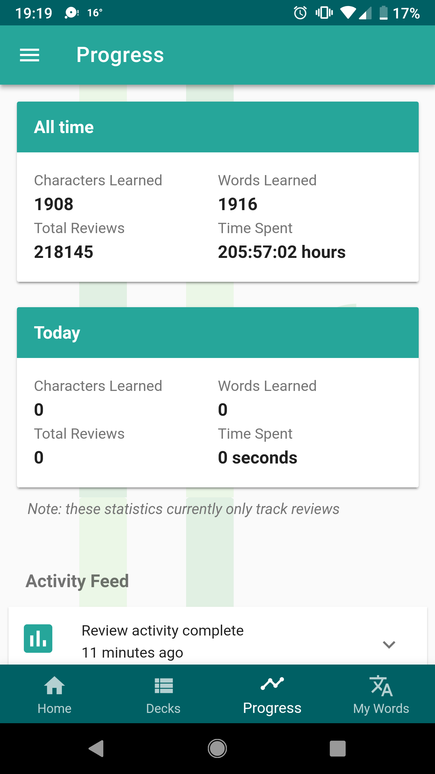
- Also under progress, the activity feed is incomplete. As I said above, I reviewed hundreds of cards today but only about a combined 60 show up.
Thanks for all your hard work and I’m sorry we all sound like petulant whiny children with our toys taken away. Speaking for myself, I just love your product and can’t wait until this new and improved version is running smoothly!
One more thing. I uninstalled and reinstalled the app to see if that would fix the lack of audio I’m experiencing (I noticed some people have too much audio so I thought it might just be me), and when I logged back in, I had 2640 reviews. I noticed then that it hadn’t been syncing with the website. The website shows no activity for Saturday or Sunday.
Yes exactly, that is the “risk” of studying currently. Spending a lot of time but in the end the time was “worthless” (just in terms of progress within Skritter), that’s why I am not willing to study until there is a fix for that. My due count already hit almost 11,000… at least I hope they can somehow reset that to 0 so I can have fresh start after bug fixing.
1 Like
i stopped studying as well until this sync issue gets fixed.
1 Like
I am also experiencing the no sound issue as others. Playing the sound for a word does not work, also when clicking on the information icon that sound button button also does not work. However, if there is an example sentence given with sound then I am able to play that sound.
My version also has the syncing issue which is incredibly annoying.
This is for Android.
2 Likes
Yeah, I think I’d like to get rid of my backlog of reviews too. I can’t wait too long though, because I have the TOCFL coming up March 16th so I guess if it doesn’t get fixed today I’m just going to have to do it on the mobile version of the website.
Thanks for the feedback guys! The criticism is constructive, we like it! 
There’s a lot to respond to here, but I’ll try and address some of the major issues you all are bringing up:
-
syncing: we did some triage this morning and are working on improving our syncing resilience and monitoring, so the beta works more reliably in more cases. Systems like this are hard to work all the kinks out of without releasing them “into the wild,” and we appreciate you all living adventurous early-adopter lives. If reviews didn’t sync and you logged out/in or deleted the app, unfortunately those reviews are lost. But we’ll be rolling out updates over this week that should fix a lot of the common issues.
-
canvas writing size: I changed the code to use more of the available space without overlapping with buttons or getting too unwieldily on tablets. But the increase is probably more ~10% more pixels for some common devices as we were already using most of the available space. Given the constraint that writing boxes are square (so the max height wouldn’t be more than the max width of the device) and that phones are generally more vertically rectangular than they were a few years ago, are your complaints more about the relative size of the canvas in relation to other elements on the screen, or that the canvas doesn’t cover every pixel of available horizontal space?
-
Japanese kana/displayed card issues: good points, we’re going to discuss these issues and add information where needed
Moreso the relative size of the canvas. There is a large amount of unused space on all sides that makes the writing field unnecessarily small. As for me, my complaint is more about what I perceive to be a massive change from the last version to this. I simply can’t write the strokes necessary, especially on 20+ stroke characters, on such a small field. Perhaps I’ll get used to it after enough time but I lost a huge portion of usable writing area in favor of a bunch of what just seems to be white space.
From the website version on my phone (pretty much exactly the same as the 2.5 beta):
From this version:
how about the sentenses with spaces bug that affects mainly the tone practise reviews? its a bloker for me?
I am not an early adopter, I would be happy just being able to normally use the old app. However the sync issues also concerns the old app, so this is not only an issue for “early-adopters”, but basically all of your userbase.
3 Likes
I would treat those alternatives orthogonally.
As for the absolute size, on my non-supersized phone, I would like it to use 100% of the available width. That said, I can completely understand not wanting to maximize it on all devices, since having to write things larger than you need to is also a huge annoyance. (While I found the smaller canvas of the beta getting in the way of writing many characters, at the same time it made writing the ones I could faster and more pleasant.) Perhaps dpi math can give you a way to pick a better minimum size, e.g. selecting the smaller of screen width or 3 inches (just an example; my phone is ~2.75).
As for the relative size compared to the other elements, that’s an aesthetic issue. Sure, I want it to look nice, but never at the expense of usability, and this is 100% a usability problem. I hadn’t even thought of the relative size.
But since you mention them, the other element I need to use the most – the prompt text I read on every single card – has also shrunk in size, whereas the remaining less frequently-used elements have grown in size and number, and the whitespace around them all has expanded to consume more real estate as well. I simply don’t understand this reallocation of screen resources.
1 Like
The canvas size issue is very much an absolute size issue not a relative one. The more of the width you can use the better. Phones are small when it comes to trying to draw complex kanji with fat fingers. Especially if you like the raw squigs feedback to show what you’ve actually written. I know juggling screen real estate use is a challenge. There will need to be compromises if you make it any larger but sometimes usability is more important than aesthetics and/or the need to scroll or pull down a portion of the screen. Keeping the different types of cards consistent also complicates it.
You haven’t commented on the reduction in grading options. I’d be interested in the rationale for that. Given the size of the current two buttons it can’t be screen real estate. I do/did like the ability to mark a card as correct without pushing the next review back 9 years
1 Like
so do we have to wait till the next update until we start using the beta?
If you look at the “Skritter: Write Chinese Beta Released" they say that they got rid of the options because you either know a word or you don’t. There’s more of a proper explanation there for lots of things.
It started syncing properly for me already.
Thanks. I had no reason to read the Chinese notes. As for “you either know a word or you don’t” - that’s nonsense. How well you know a word is not binary. There’s an infinite scale of how well you know something. If I mark a word I haven’t seen for ages as correct it will disappear for 9 years
3 Likes