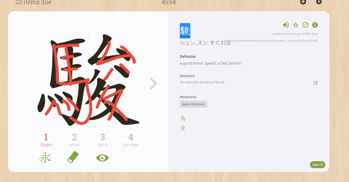
I was promted to write 駿 and i expected the following
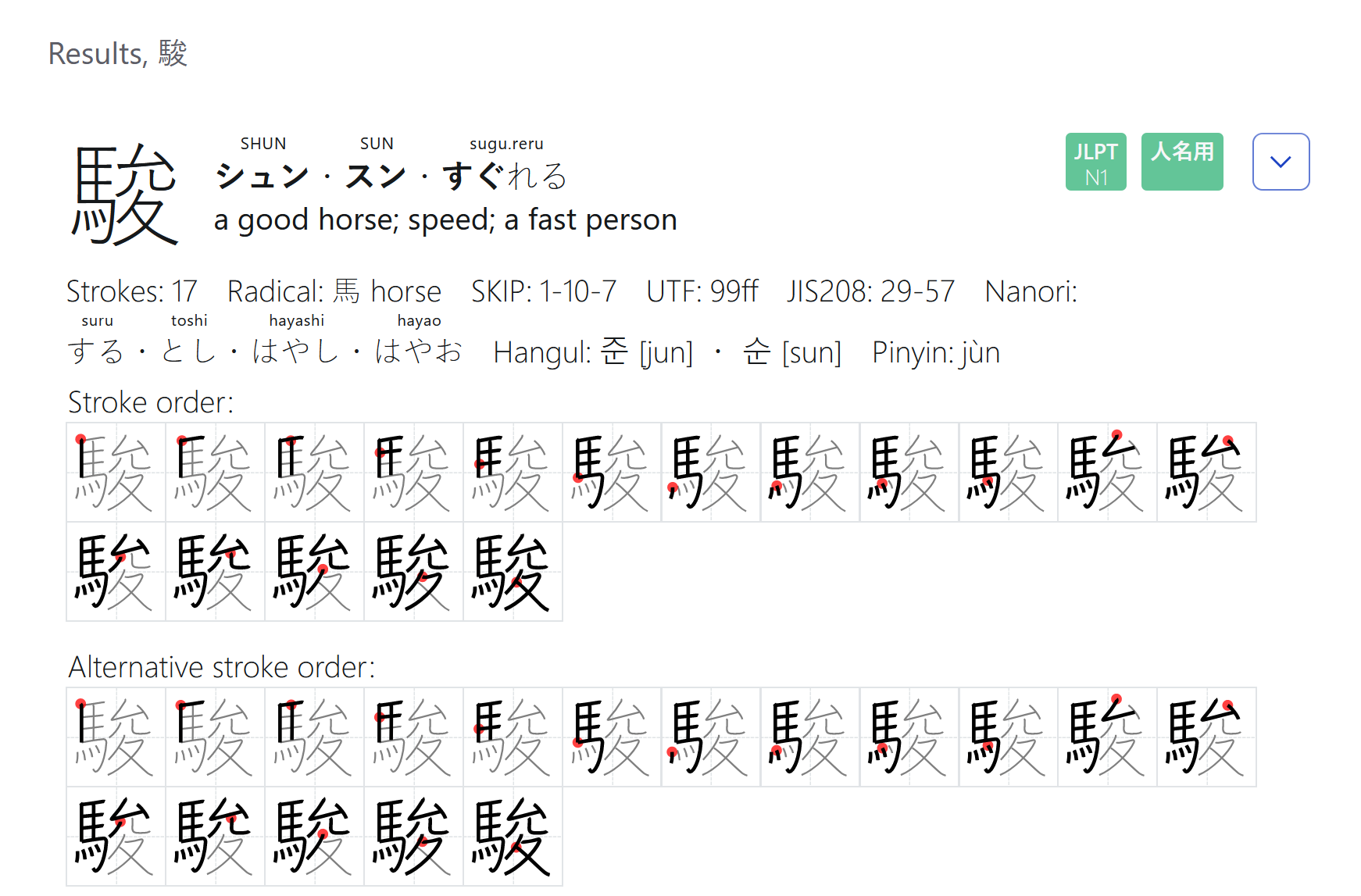
But instead skritter expected this:
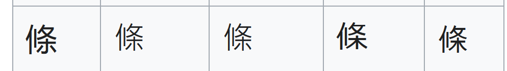
I might have found the opposite example, but I am not sure. I am not fluent in Chinese so i cannot tell if both variants are okay in chinese. I consulted whatever dictionary I could find and most of them showed me 条 with 木 when using my computers font. Now I do not know if these dictionaries enforced a chinese font or not and it might just be that my computer used a japanese font. However ALL chinese dictionaries displayed the individual strokes use ホ instead of 木
Also I verified with wikipedia and this indeed seems to be a difference between japanese and chinese
So considering that ホ seems to be preferred in chinese, I assume this is another instance of this bug
I did not even know that 条 with ホ and 条 with 木 were the same character or shared a unicode code point. So i can say pretty confidently that this must be the first time it requested the wrong variant. This might be related to the following bugs:
But I do not seem to experience these bugs at the same time. they seem to happen independently
駿 has been updated with a more Japanese-y hook for the 允 component. Thanks for pointing it out.
In Chinese, both variants are acceptable, it largely just depends on the font as a stylistic choice. 条 is the simplified form of 條.
I was also wondering what causes skritter from requesting a different variant for 条 because before that incident and even every time after that i have only seem it use ホ
It’s just a stylistic choice. As I mentioned, both variants are acceptable in Chinese, and the 木 with the hook more closely matches the font we use for Chinese, so for Chinese we use a hook.
For the Japanese variant, we use more of a 木 for similar reasons–it matches our font of choice and is an acceptable variant in less calligraphic styles. Check out 「条」の書き方 - 漢字の正しい書き順(筆順) for reference and examples of what 条 can look like.
Part of the variation you’ll see on Skritter between our Chinese and Japanese characters (besides the conventional differences between Chinese and Japanese characters in general) is that we use a 楷体/楷體 font for Chinese and a 教科書体 font for Japanese, so they sometimes adopt different conventions for different components.
This topic was automatically closed 30 days after the last reply. New replies are no longer allowed.