I noticed that the upper left stroke in 火 is quite hard to remember. This is because in the character 火 there is a “right falling” stroke, while when used as a component such as in 谈 or also the radical in 灯 (and others), it is a “left falling” stroke. On Google image search you will find both variants for 火 and also for 谈, so maybe it is not that strict of a rule?
What is quite frustrating is that when I practice drawing the characters in Skritter, it will only accept left-falling for 谈, only right-falling for 火, whereas for 灯 Skritter seems to accept both variants. So I don’t know how I should try to memorize it.
Could someone tell me which variants are more common or correct? Is Skritter’s behavior correct or should it maybe always accept both variants?
We should probably update how we handle this character, but in the meantime, I’ll quickly go through what it’s supposed to be like.
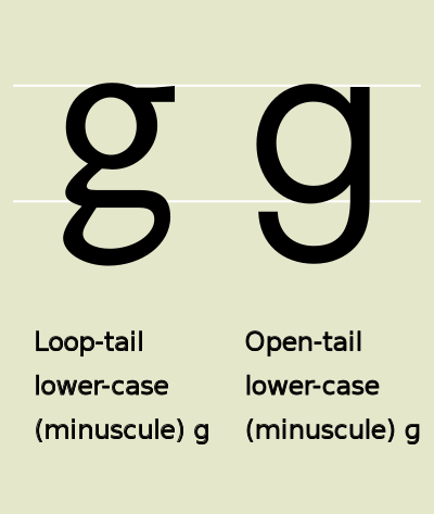
What you have spotted here is one of the many slight variations in how characters are written while still being considered the same character. Think of it as the difference between single-storey and double-storey small “g” (like this). In everyday life, which you write won’t matter, and only a picky person will even notice which one you use. In the case of 火, the left-sloping variant is standard in mainland standard, and the right-falling variant is standard in Taiwan standard. How real people actually write is harder to answer, of course, but normal people usually don’t care about these things and keep writing what they once learnt, even if it’s considered “incorrect” by the currently prevailing standard.
That’s not what your question is about though, so let’s address what it’s supposed to be like in mainland standard. The left-falling dot should be used for the stand-alone character, but also when it’s used as a non-compressed component (such as in 谈). When compressed on the left, as in 灯, the slope is less visible, but still left-sloping. Note that all these are still just classified as dots and are sorted without specifying direction (this really is just a typographical preference).
For the sake of completeness, the opposite applies to Taiwan standard in all cases mentioned above.
Ideally, both variants should be accepted, but we should display the left-sloping one as default. I’ll get back to you when we’ve had time to discuss and/or fix this. Thanks for bringing it to our attention!
Thanks for this explanation. This makes a lot of sense. I am happy to learn that the dot in 火 and 谈 is actually supposed to look the same, because otherwise it would be a bit too inconsistent.
I am looking forward to reading from you once you have discussed it.