So I recently re-started using Skritter via the web app on iPad in landscape mode and it’s pretty nice! Here’s a little feedback about screen space, maybe you will find it useful.
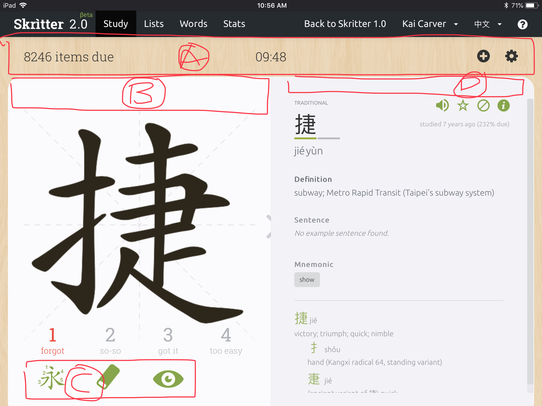
In the image below I’ve identified four areas where it seems like space is wasted.
There are two main reasons why lack of space is a problem for me:
There’s a part of the white space I expect to be able to write in but which is not writeable. This causes the whole page to scroll and wastes time and messes things up. That’s mainly area B in my screenshot.
Some of the very useful info on the right side is hidden, requiring me to scroll. That mainly concerns areas A and D in the screenshot.
The info and buttons in area A could be merged into the top black bar. Except for the time spent studying, I don’t use area A’s info or buttons very often at all.
Area C is less important: it has buttons that I never use (I use taps and strokes instead), but I guess are useful for beginners. And anyway space there doesn’t matter as much, since with the current UI that side is dedicated to writing and scoring, and there’s plenty of space for that already.
That’s all the feedback I’ll give for now. Nice job overall and keep it up!
Update: OK so, not related to screen space, but re: my return to Skritter, there’s good news and bad news:
Update to the update: there’s no more bad news, the web app started working again!
Good news: I used the app on Android, and it worked really well for me, on an old slow phone, too! Offline mode seemed ok too though I didn’t test it offline.
(I did sometimes notice writing gets unusably slow after a 100 reviews or so, but I think it’s nothing a restart doesn’t fix).
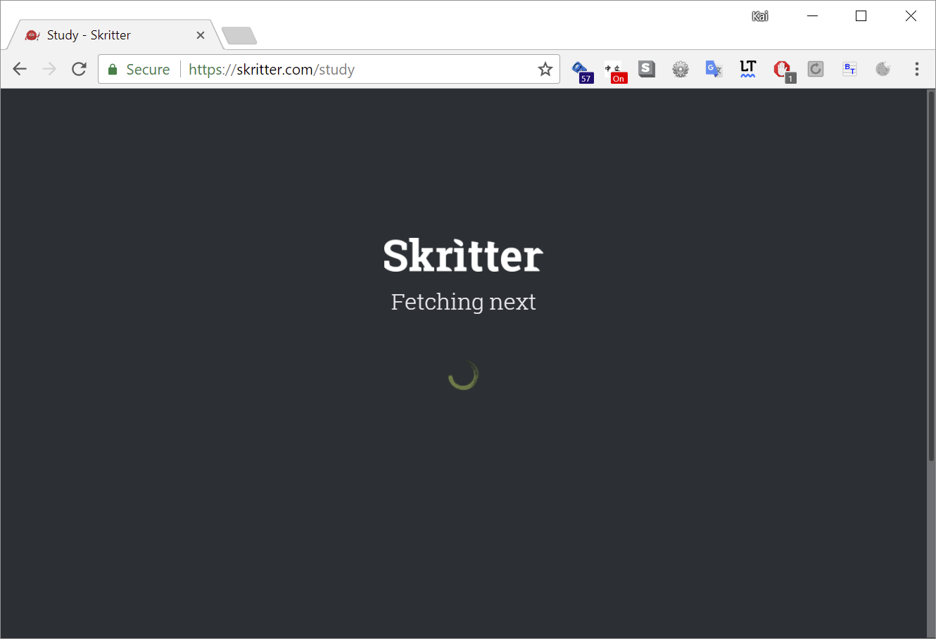
Bad news: ever since I used the Android app, the web app is stuck at the dreaded “Fetching next” screen after I press Study.
This happens on iOS Chrome, Safari and on Windows Chrome.
Legacy Skritter on Windows and the Android app work fine.
Update: web app works fine again.
I wonder if using legacy Skritter unblocked it?
Or maybe someone fixed something.
Thanks for the feedback, definitely some good comments about space usage that should be easy to improve. I can’t say we’ve tested the website extensively on landscape iOS, but that is a use case we will be on the watch for