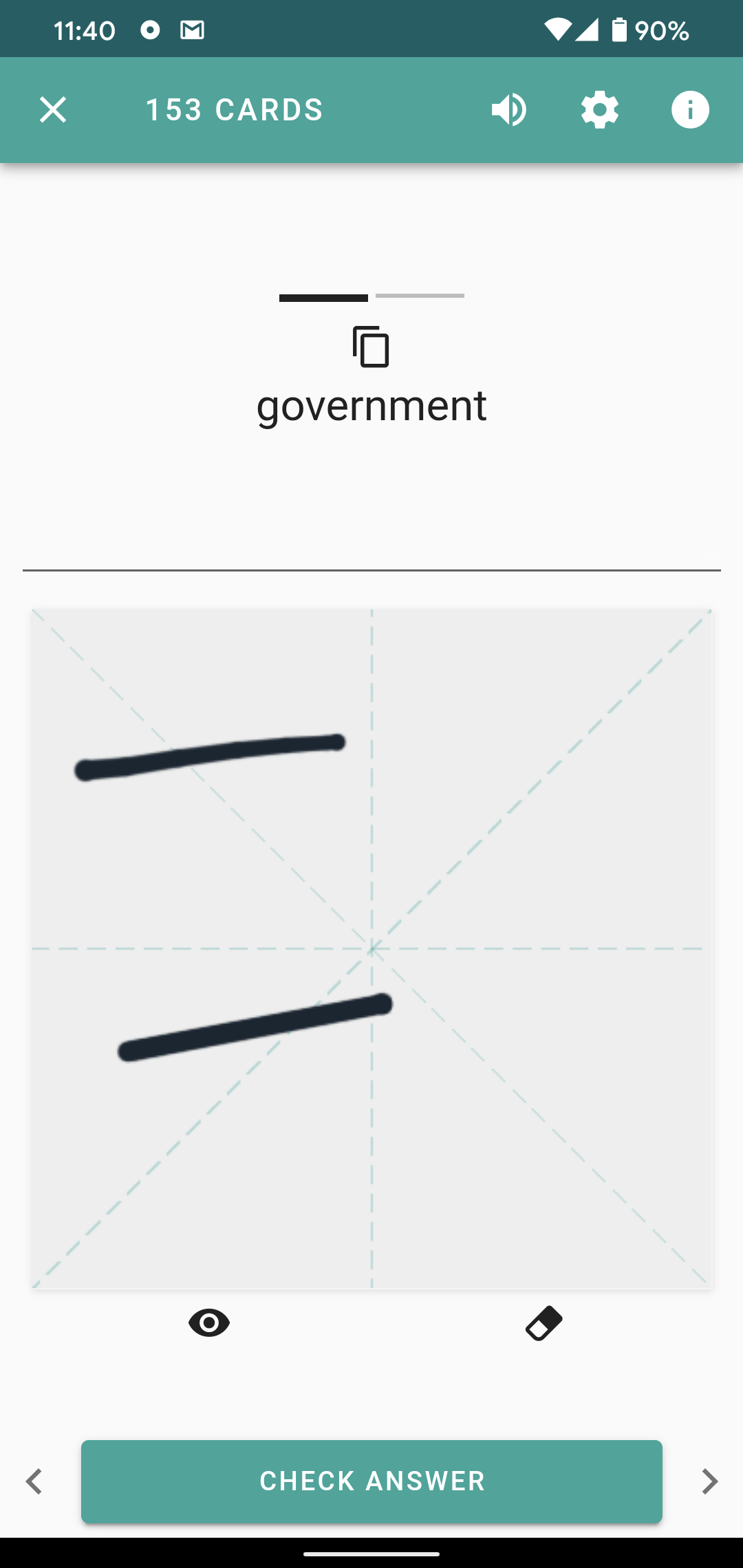
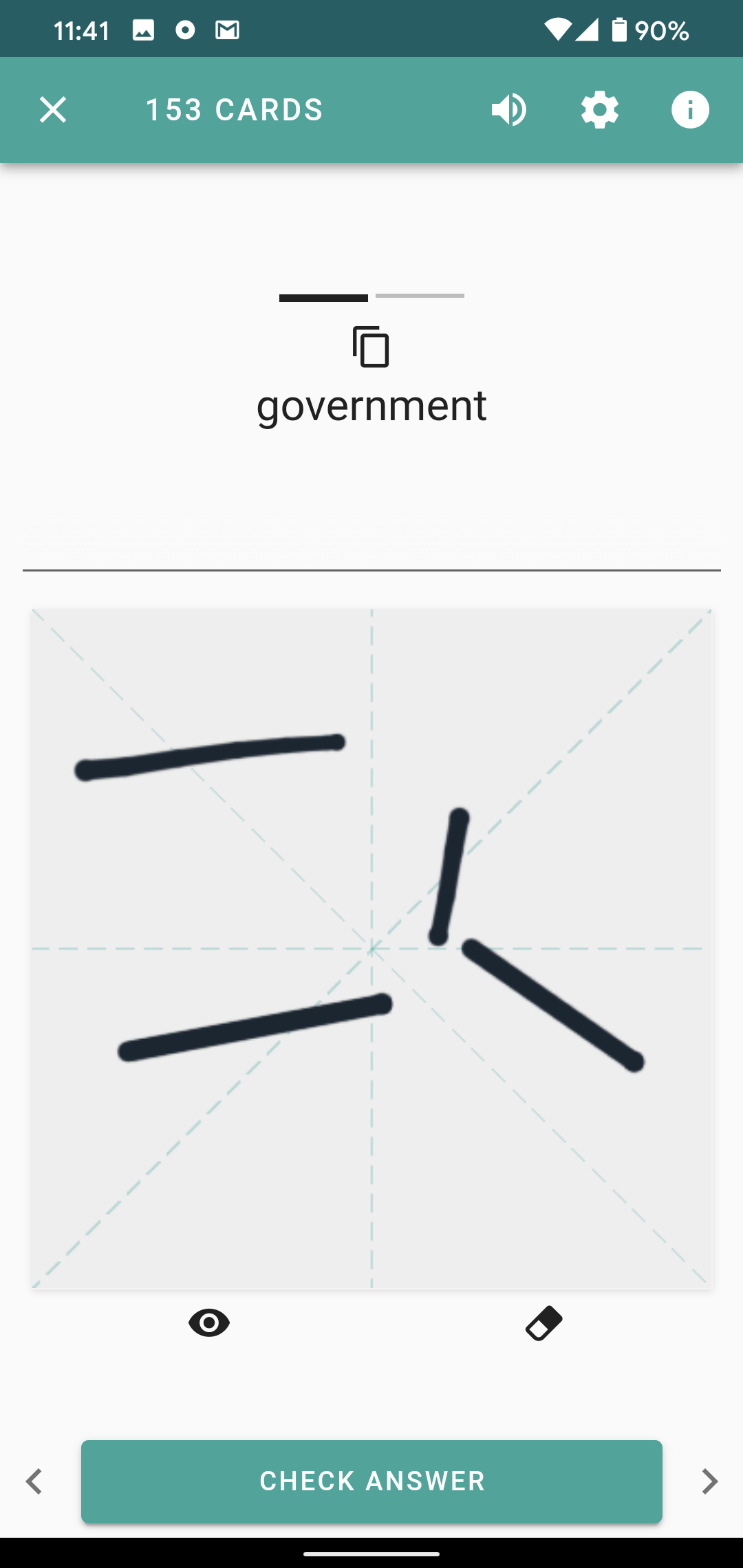
Just checked out the new info screen in the new beta. Have to say it defeats the purpose.
For me the best of the old beta info screen was that one could quickly pop it up and out when wanting to look up a missing piece of Information. The best of the legacy info screen is the ability to check in detail for character and radical definitions, albeit on a separate screen.
So what I was really hoping for in the beta is best of both worlds: a side slide-in info screen as previously but with easily reachable and augmented information inside. Single clicks for popping up information.
But now we got an info screen on a separate page which has…subpages. It takes forever to navigate for a certain piece of information.
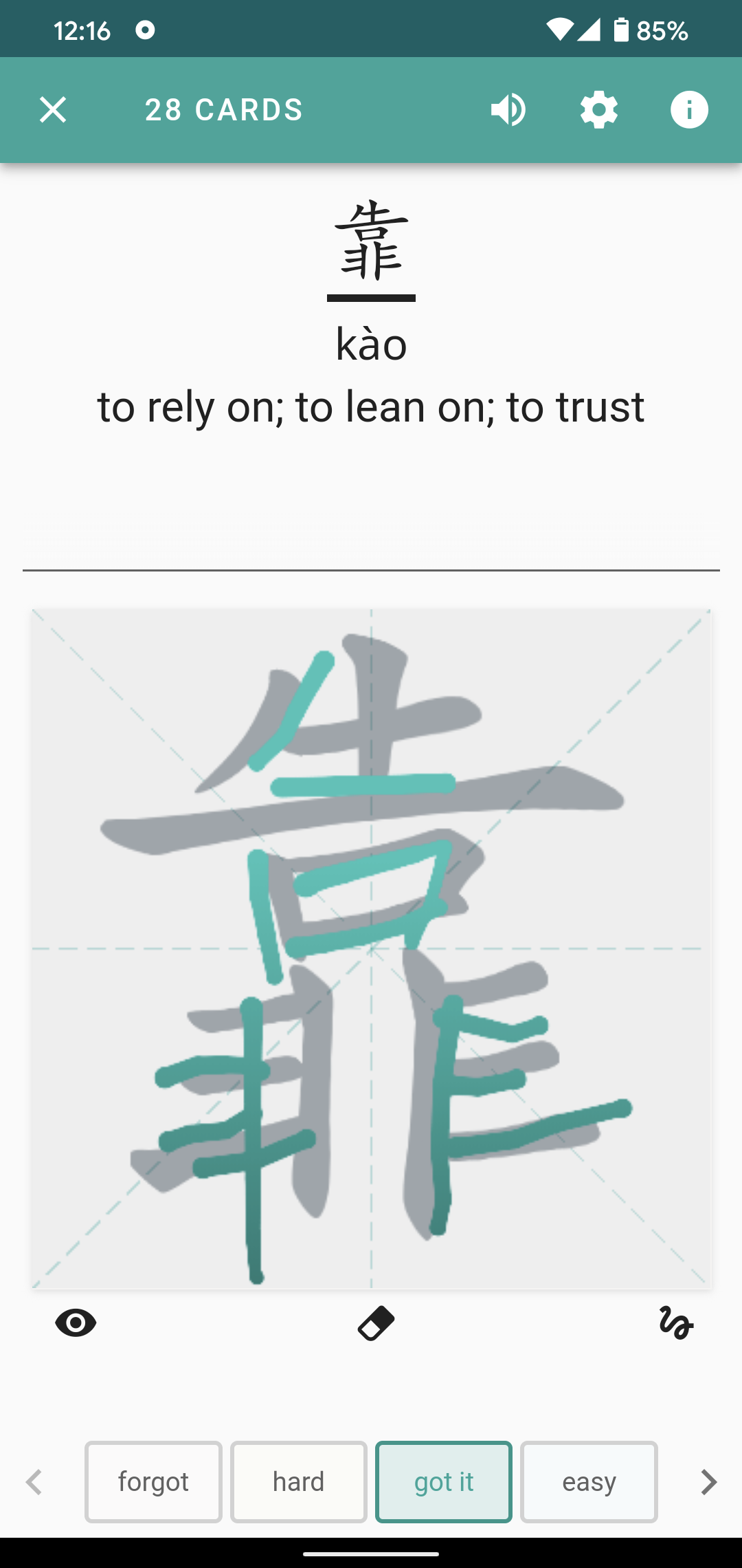
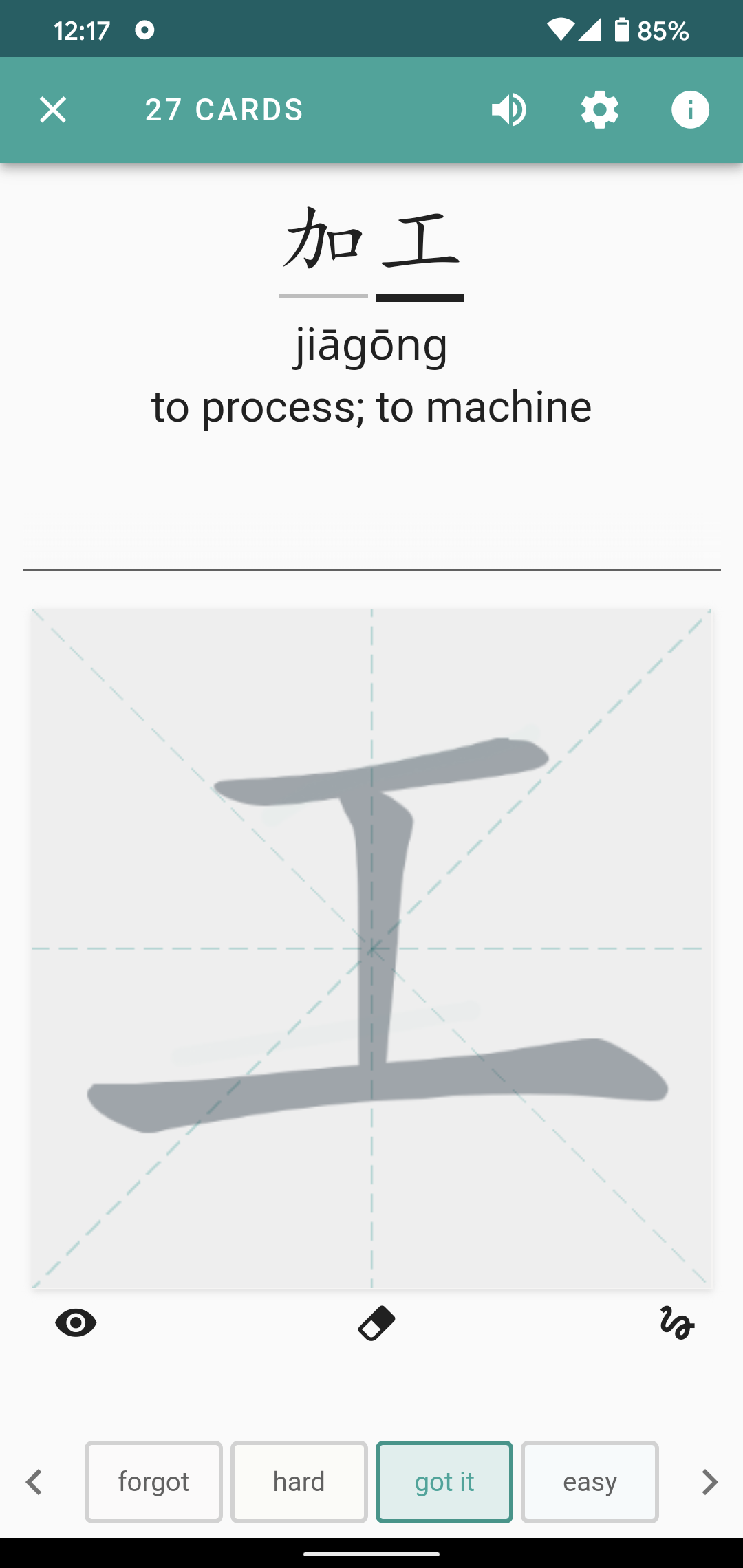
And on the subpages there is information which could be integrated much more easily. A separate page just showing the single characters with their meaning and an audio icon? Why? You could just make the single characters clickable in the main info screen.
Also there are design flaws such as the info screen open button being on the top right but the info screen close X button on the top left. How to quickly open and close with a tap? Need to use different fingers now or shift phone in the hand.
I would really hope the best of new and legacy design will be combined here, and not the worst.
Please also keep the legacy app in the App Store as so far it is still my preferred way to use Skritter.
EDIT: I found that you can actually click the single characters on the subpage for more radical information. That’s nice, but I still think that it is way to convoluted. Why not clicking the characters in the main review screen directly? My hope would be to be get my information faster within Skritter than by clicking the Pleco button.